THE context
The Seattle VA Medical Center is the primary Veteran hospital facility in the Pacific Northwest and the 5th largest nationwide. While their technological innovations are excellent, a poor wayfinding system was losing them millions of dollars annually while negatively impacting the visitor experience.
The 44-acre campus was an arduous challenge to navigate. Every day, staff members stop whatever they are doing to assist disoriented Veterans. Unfortunately, this kindness adds up to lost time and productivity when staff are pulled away from work.
We did the math - a conservative estimate of this lost time is about $2 million per year. A fraction of that amount could resolve the wayfinding issues.
the CHALLENGe
Improve the patient experience by implementing a clear, cohesive, and comprehensive wayfinding program.
SKILLS BILLED
Community Research
Learning Design
Concept Development & Design
Fabrication Management
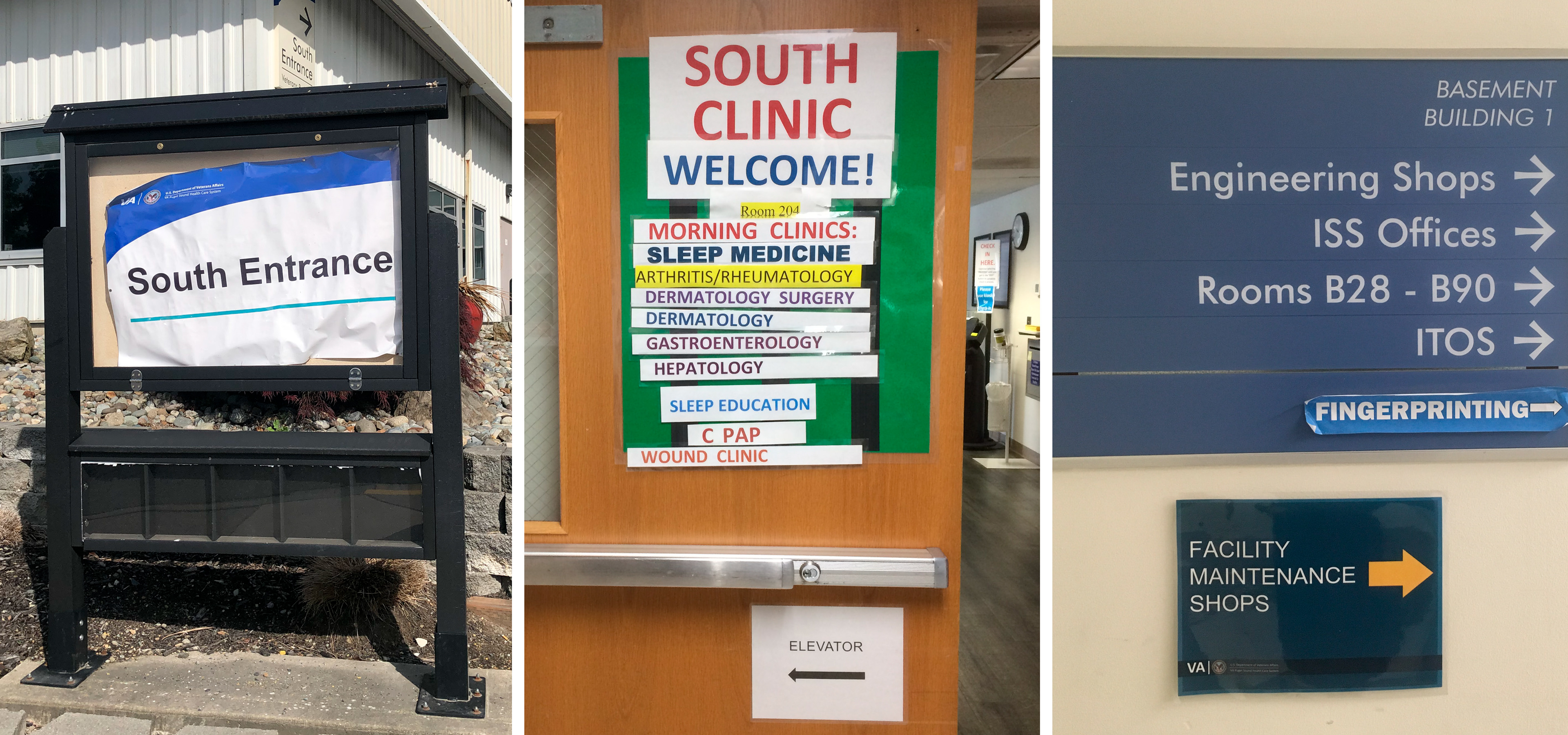
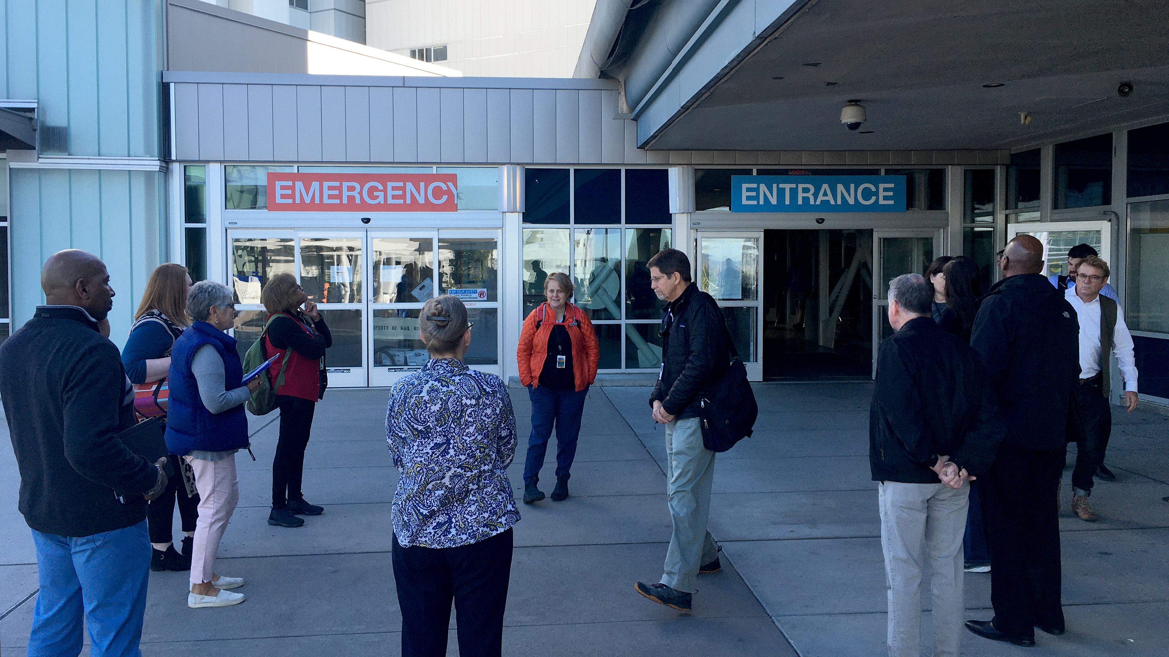
As a result of the site location (on a sloping hill) and multiple remodels over many decades, the sprawling facility has been historically confusing to navigate even for those who have been walking its halls for years. Entrances to the hospital are on various levels, floors between buildings do not align, and the interior hallways have no landmarks to orient visitors inside the buildings. DIY wayfinding solutions from staff, though well-intentioned, are inconsistent and non-ADA compliant.
This lack of cohesion negatively affects patients, providers, visitors, and volunteers.
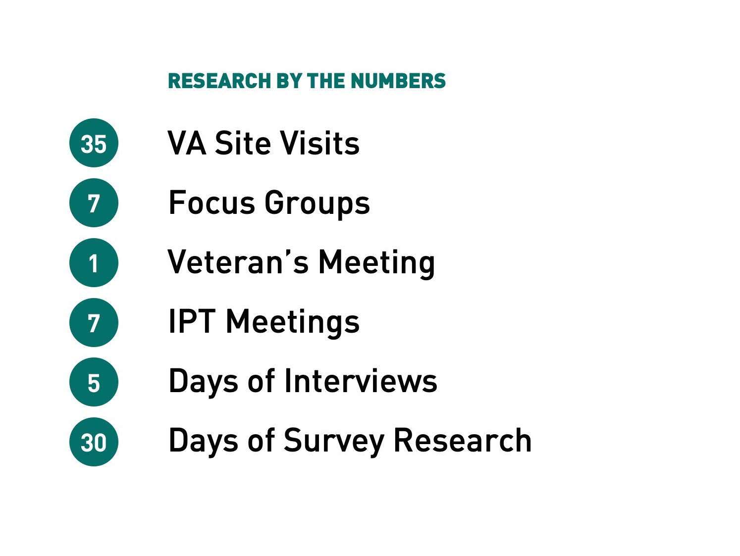
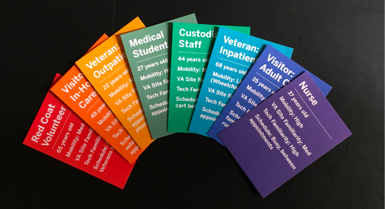
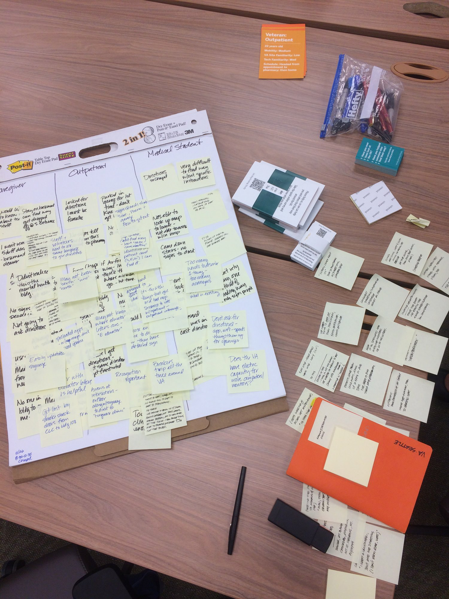
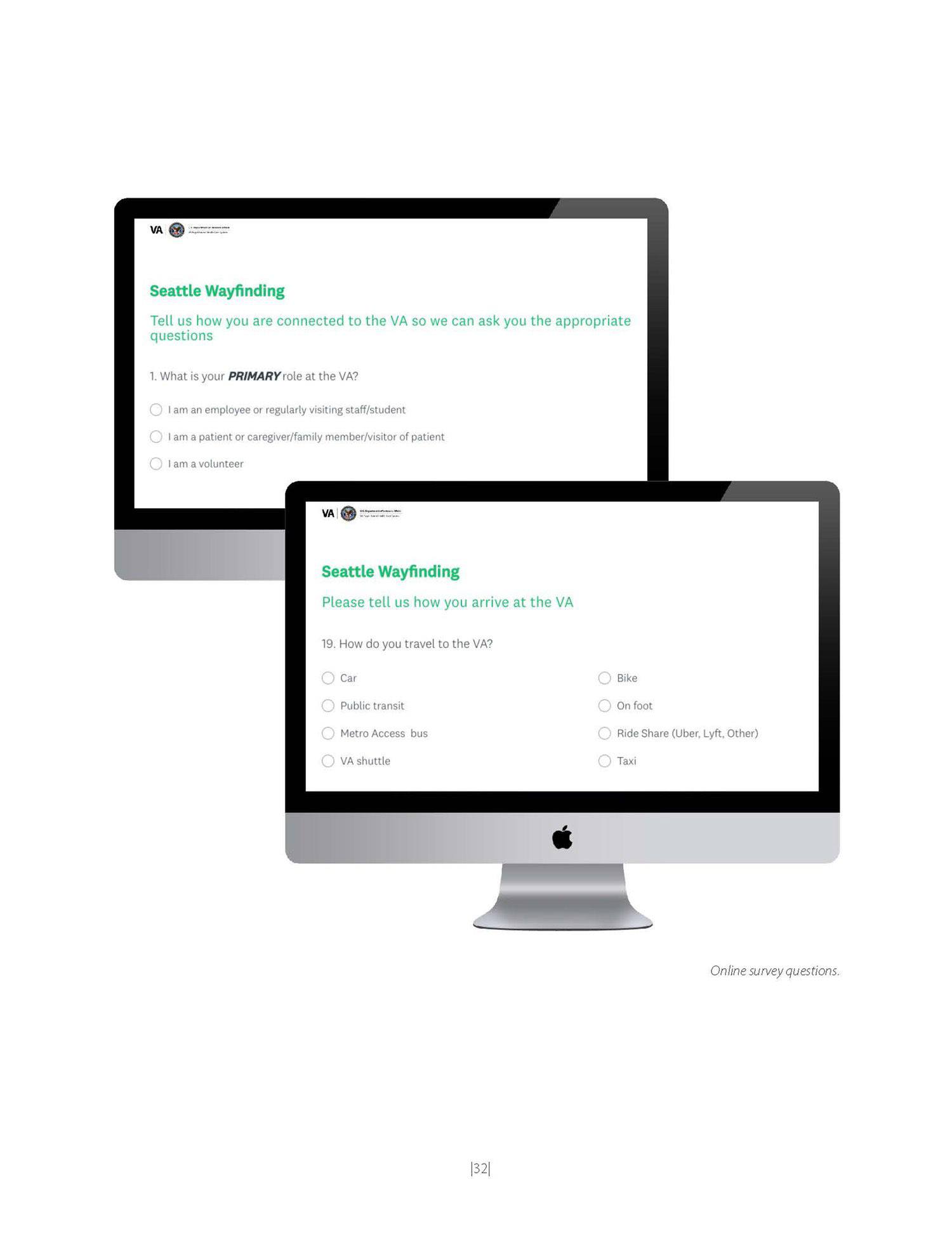
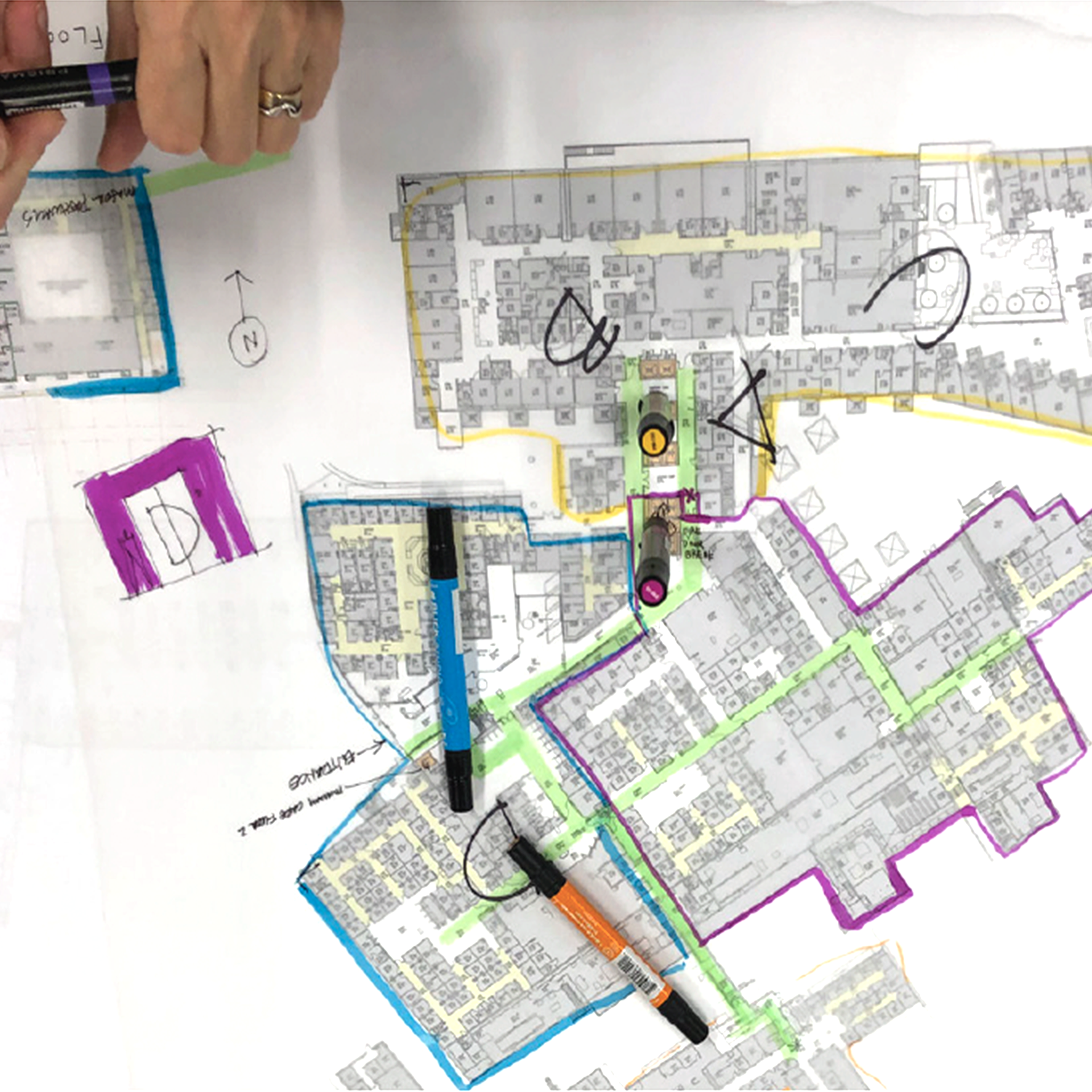
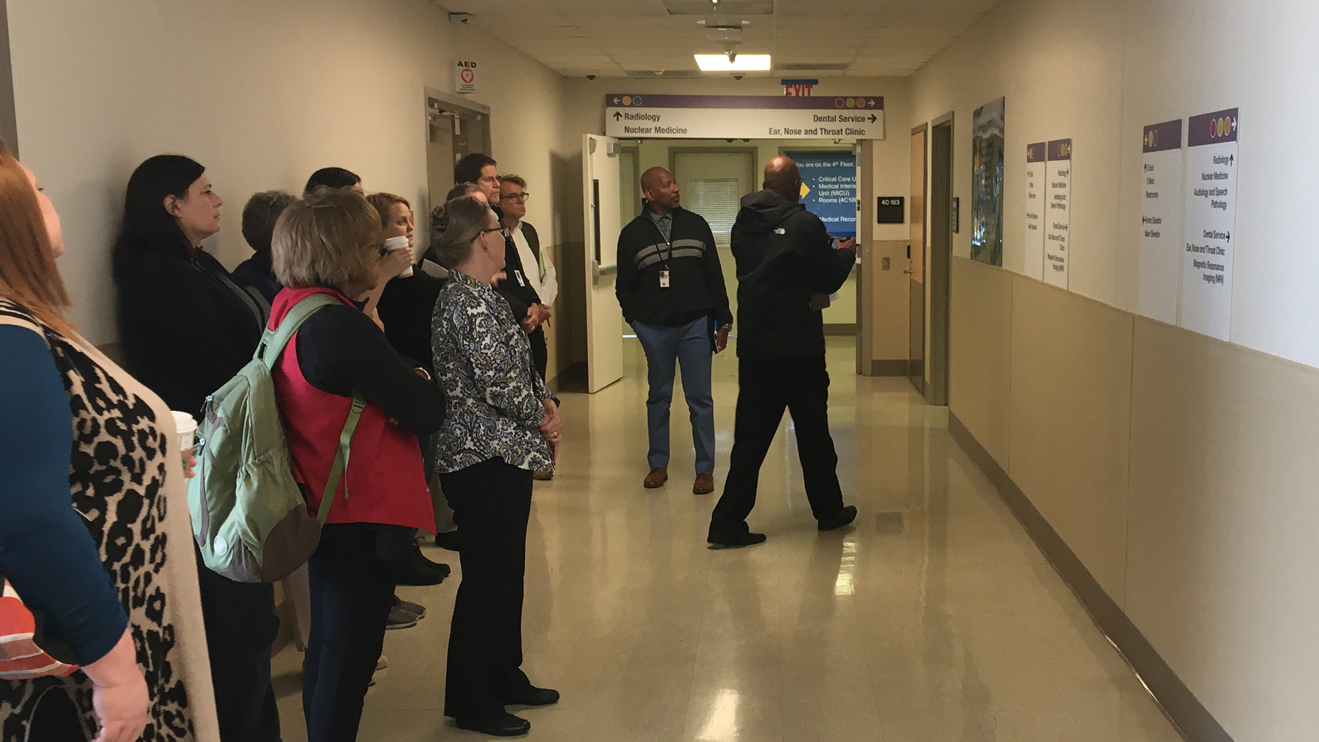
To get our bearings, we turned to the folks who know the campus best: veterans, staff, and volunteers.
Candid conversations, survey responses, and navigational exercises informed our quest for insight - how does anyone reliably find their way around this labyrinth?
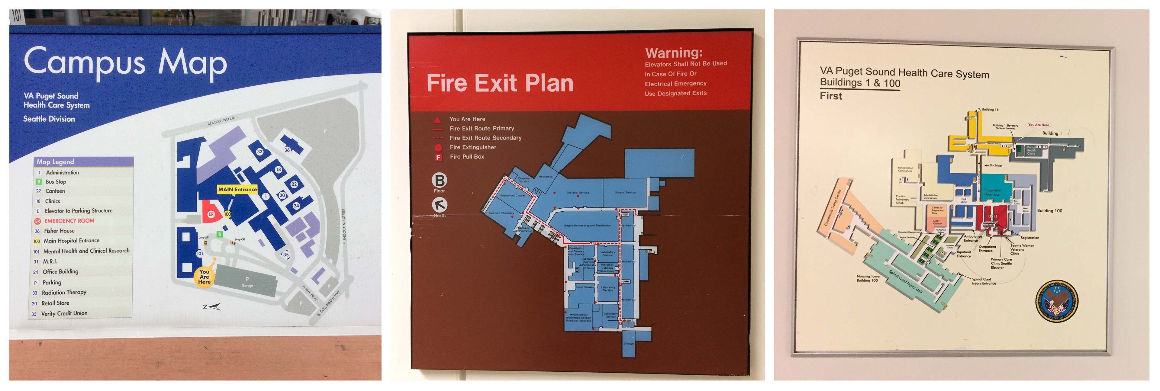
We learned that a major source of confusion is a lack of consistent, reliable maps.
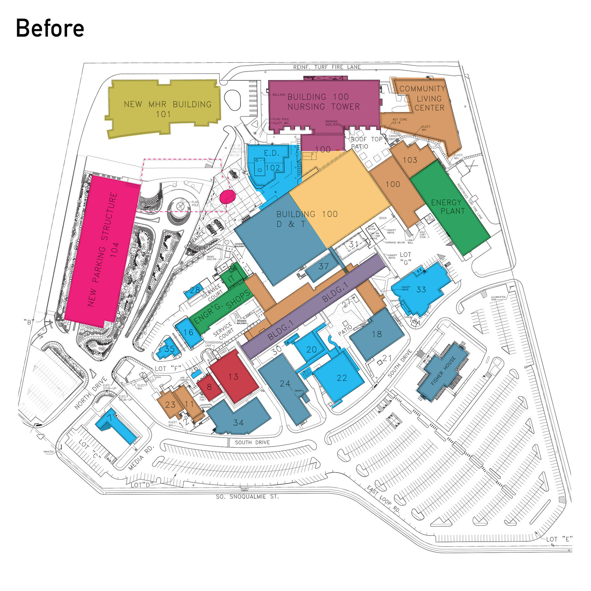
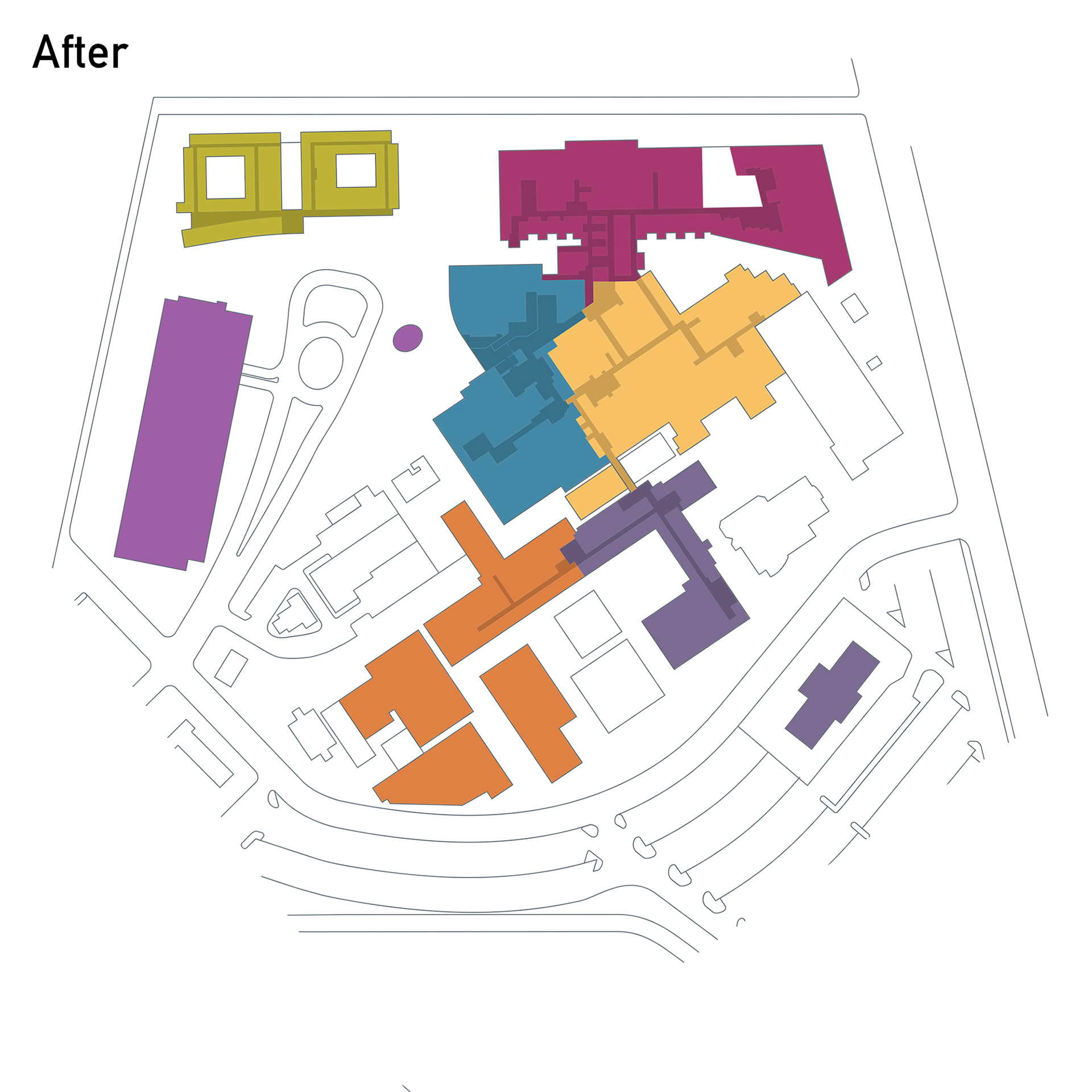
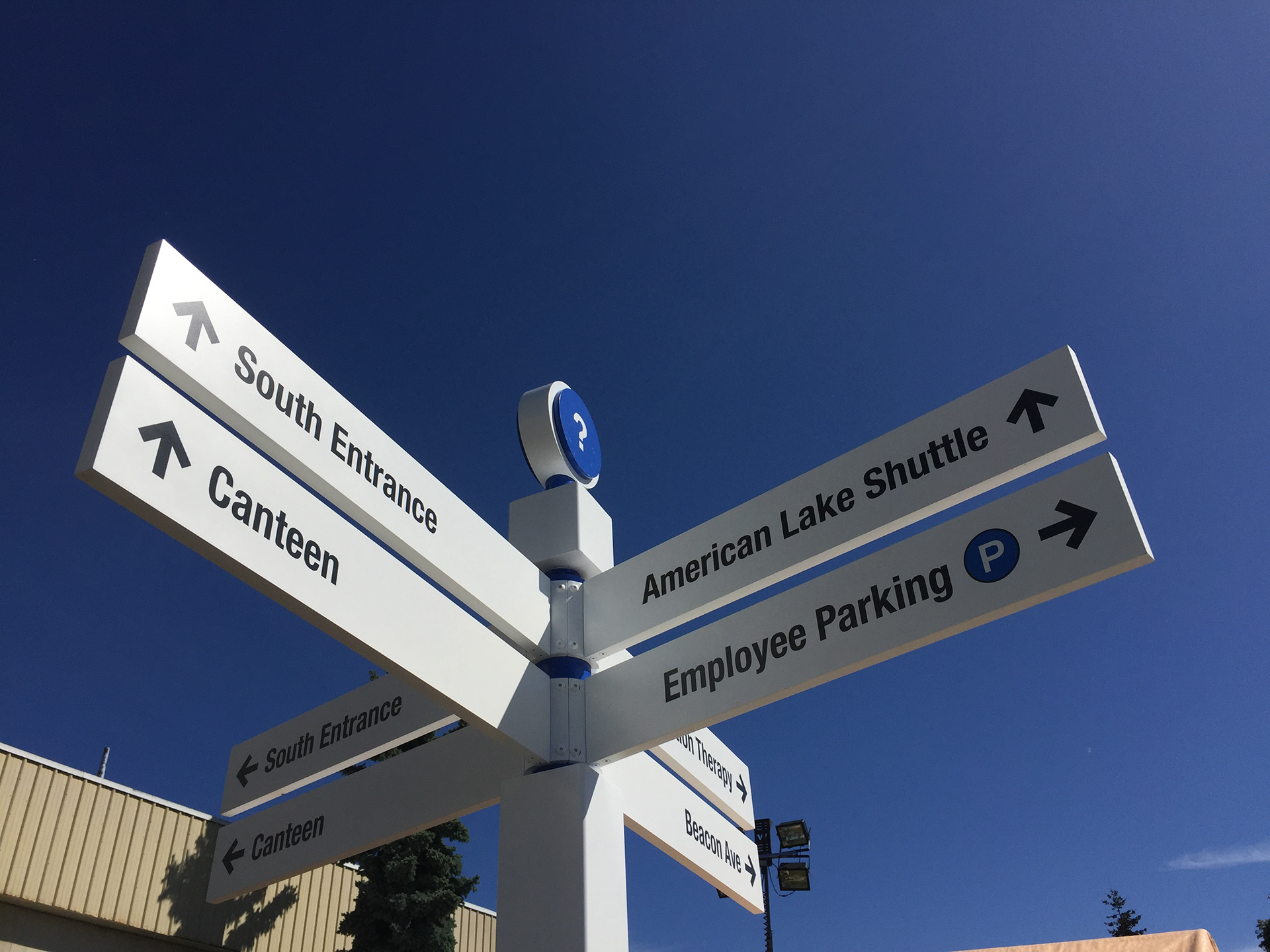
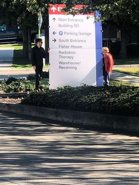
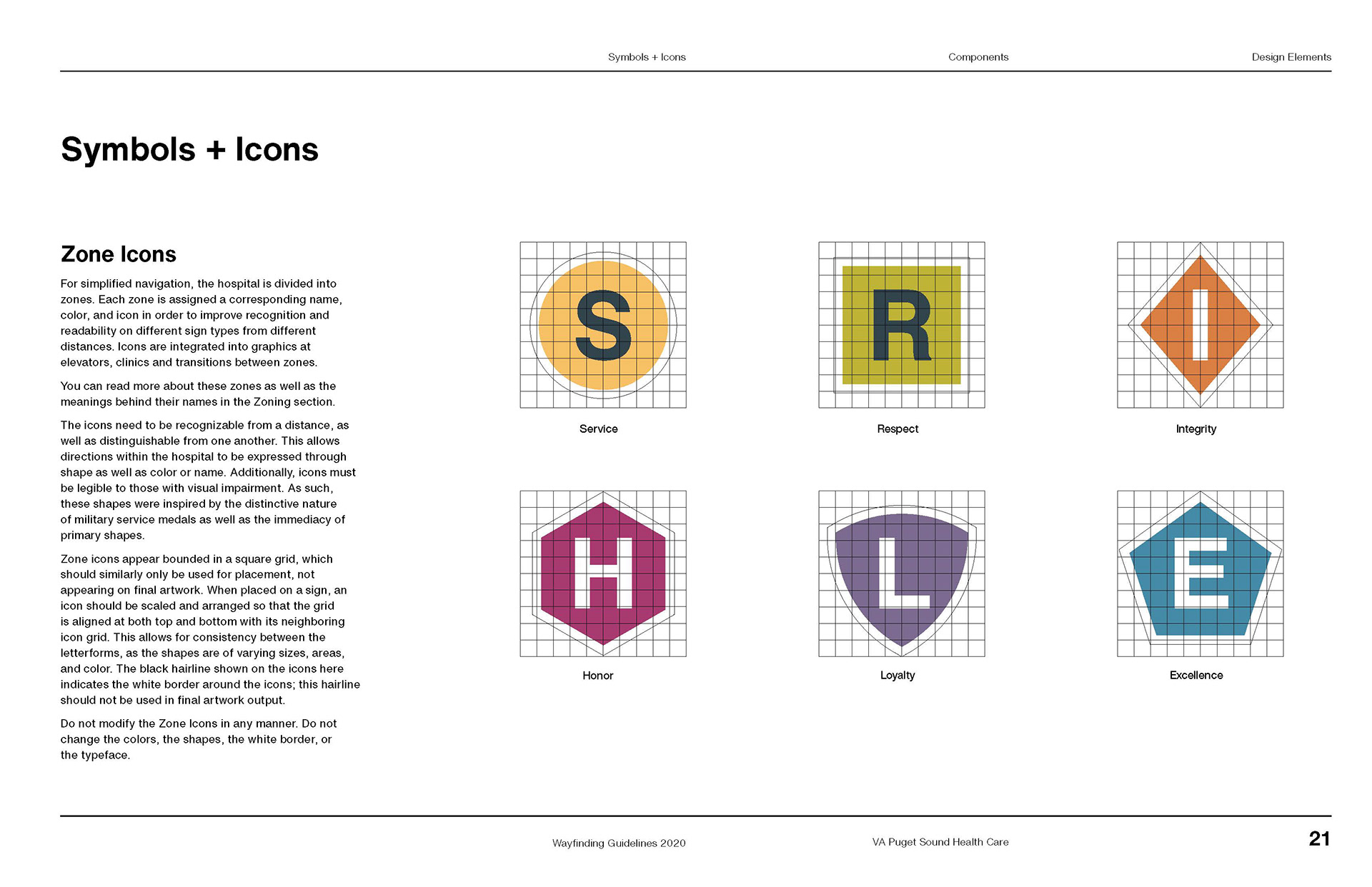
To simplify successful navigation, a zone system was used to divide the VA’s buildings and spaces into smaller segments.
Zone transitions are located based on natural transition areas across the facility and continue vertically according to building layout and elevator access. Zones are organized in such a way that contrasting colors always border one another, adding a clear distinction between zones.
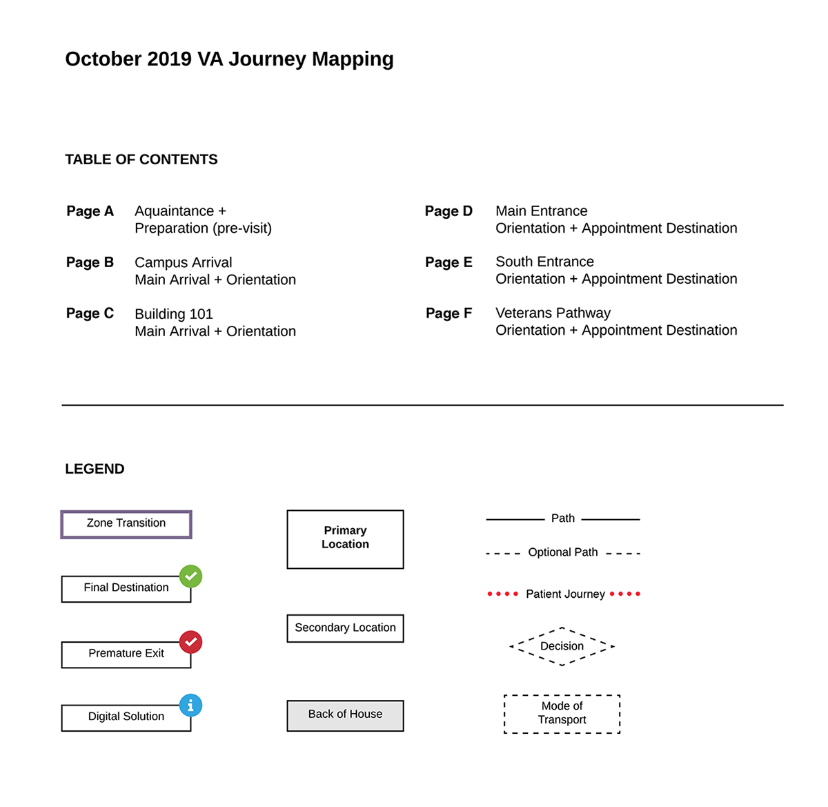
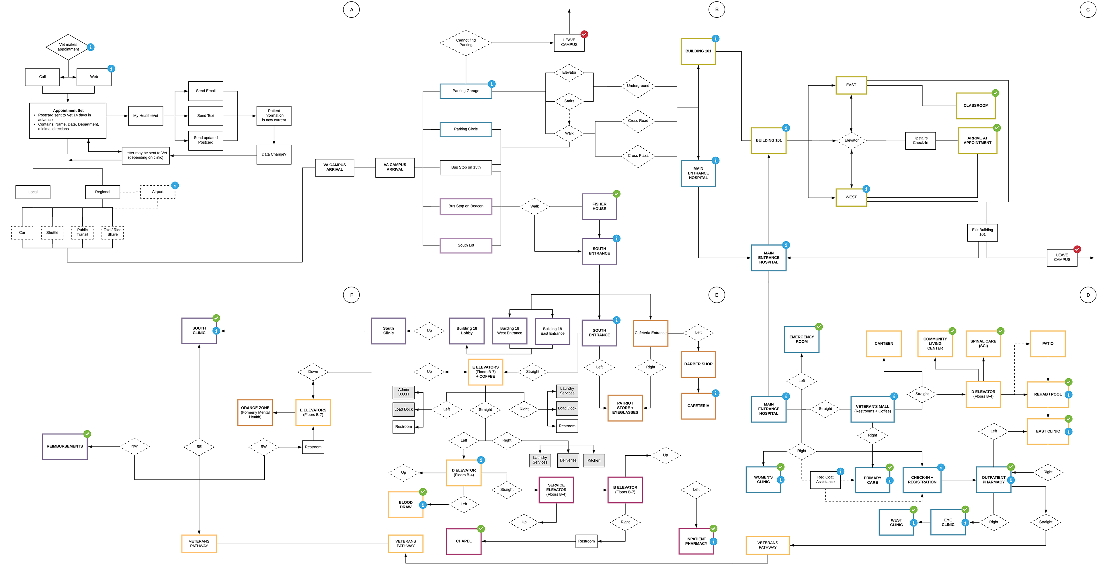
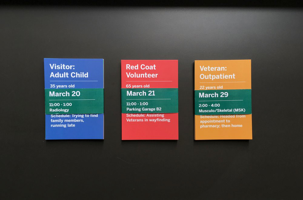
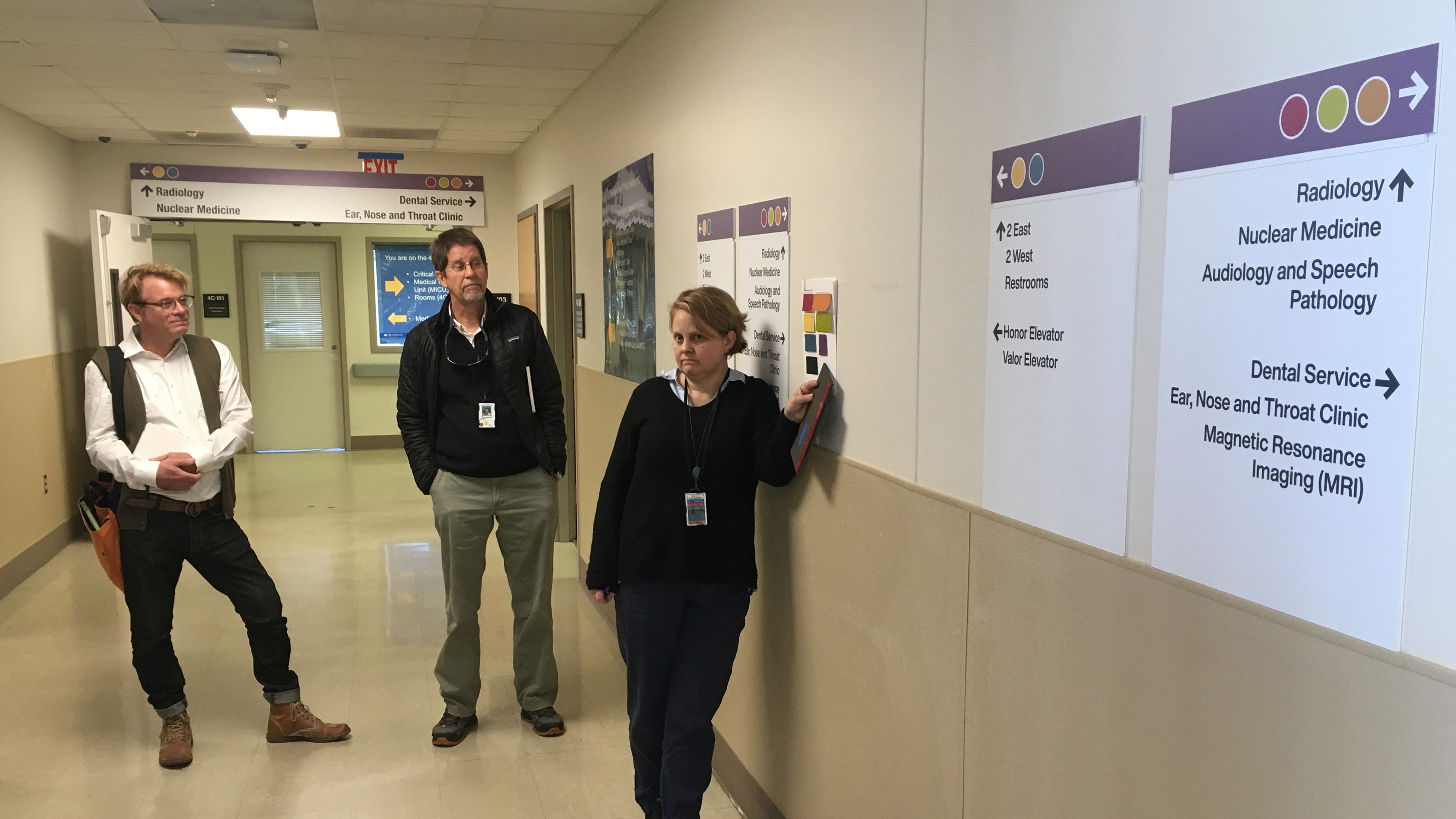
Journey mapping and mockups shepherded our concepts from theory to reality.

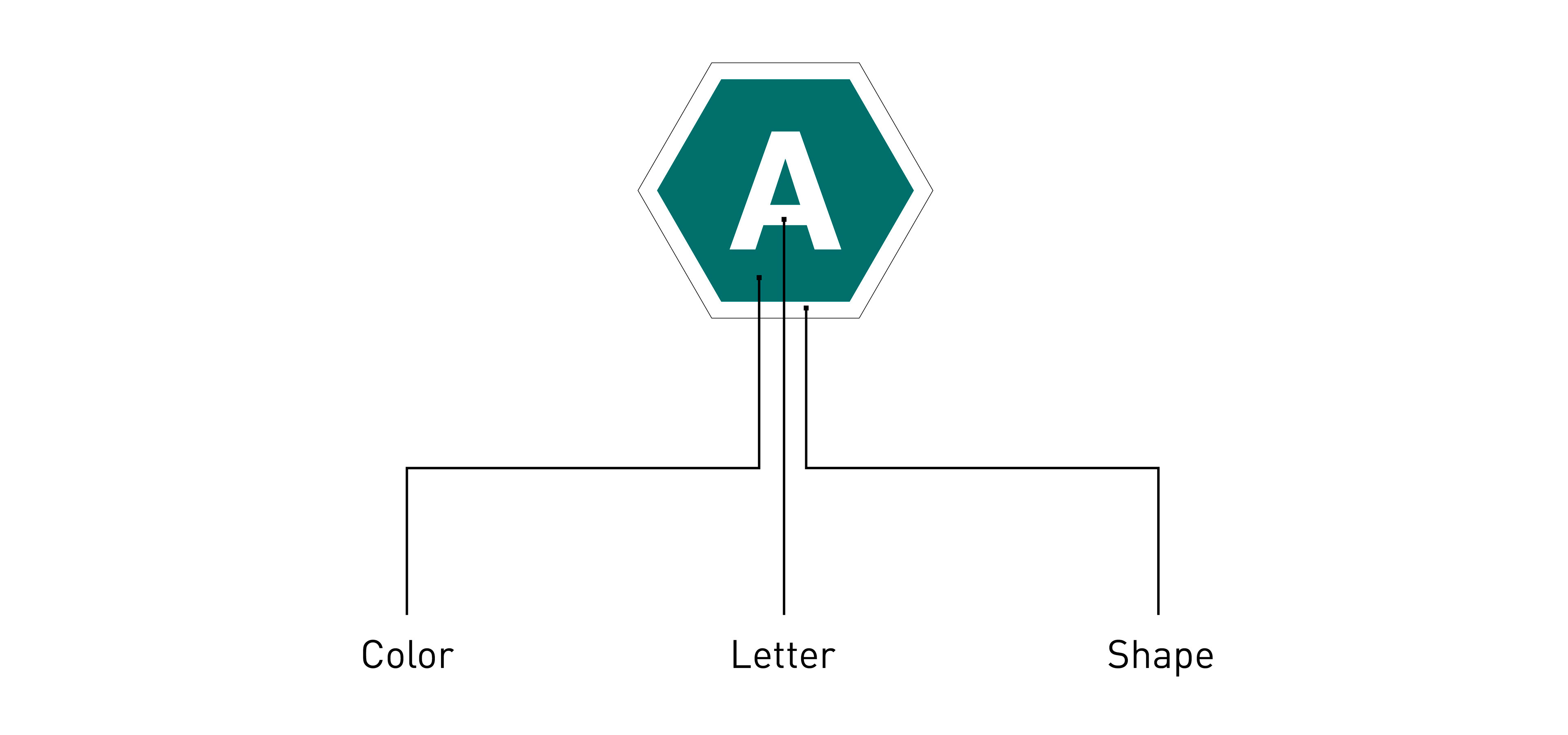
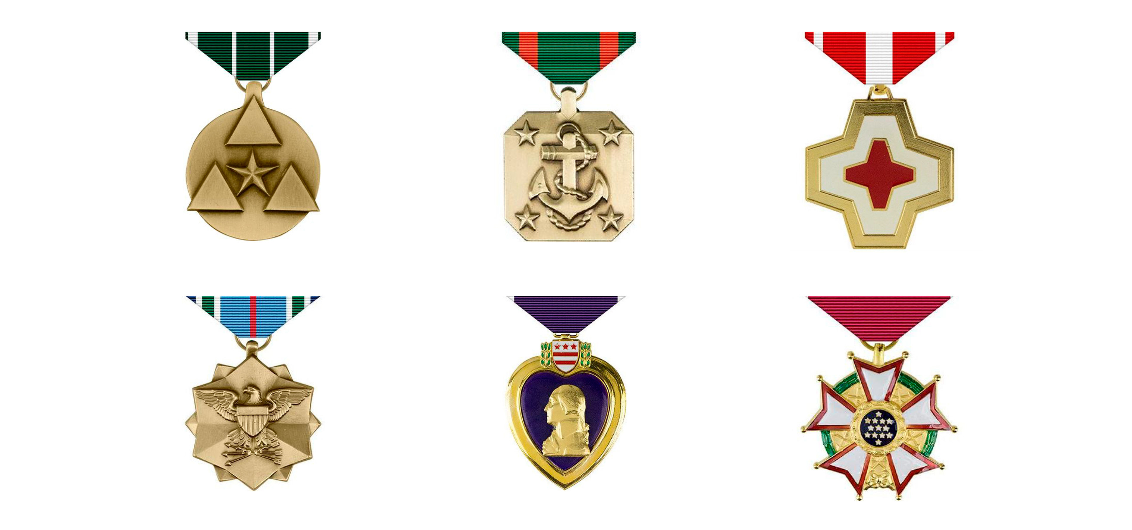
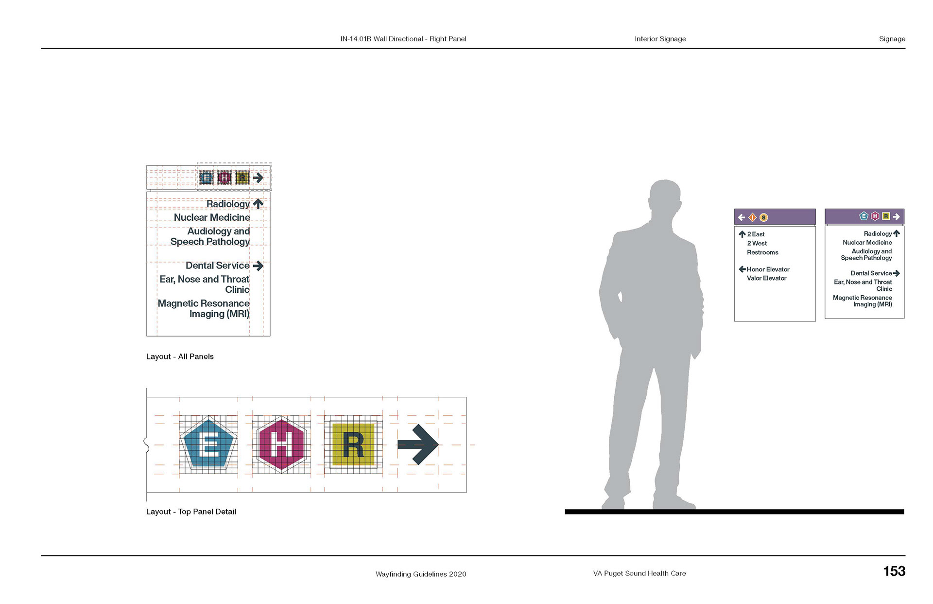
Zone icons leverage the first letter of the zone name bounded within a colored shape. These icons were loosely inspired by the simple, iconic forms of US Military medals.
The use of a distinct letter, color, and shape for each zone provides multiple cues that aid in the identification of zones and signs, as well as the retention and recollection of directions.
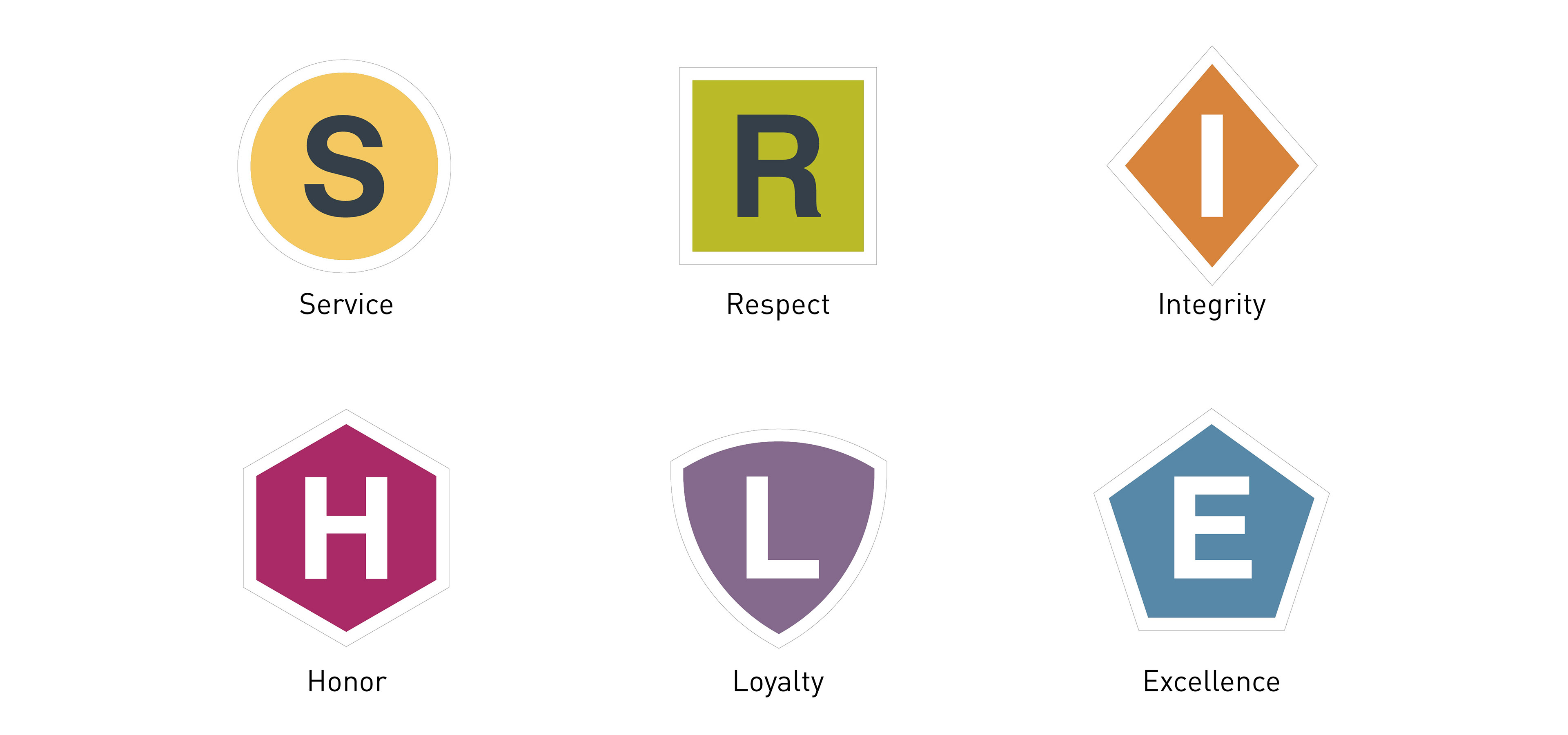
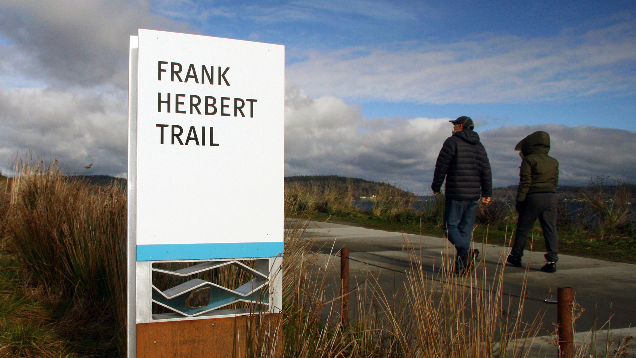
Zone names were decided by patients, staff, and volunteers. Respondents chose six core values of the VA and US military that resonated most with their role at the VA Puget Sound. These values encompass the professional and personal lives of Veterans and civilians alike who contribute to and enrich the culture of the VA.
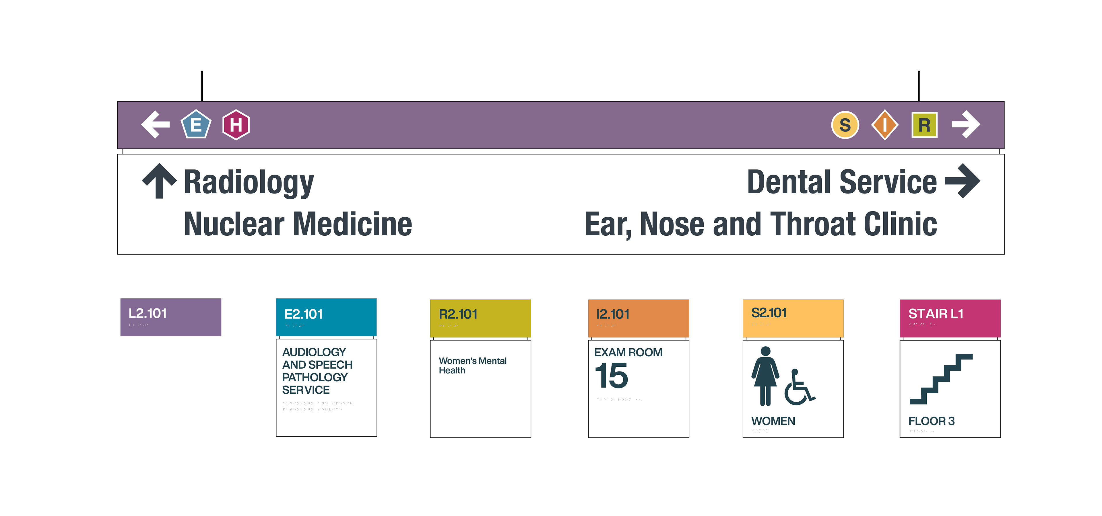
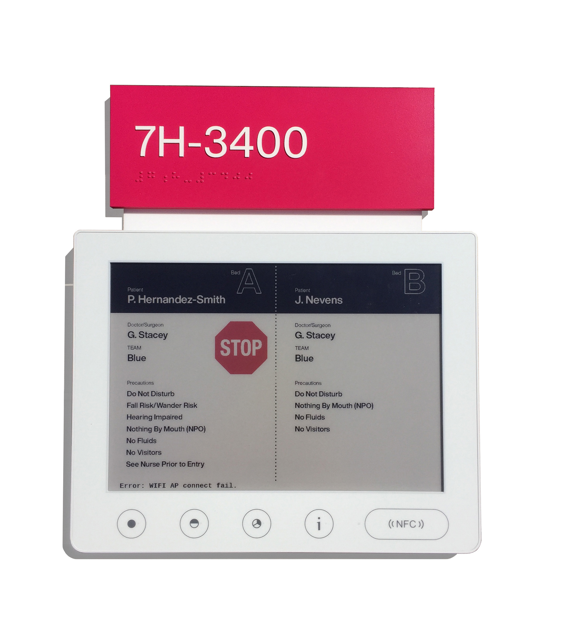
The VA sign family uses the design technique of progressive disclosure, which aids wayfinding by presenting information from the macro level (zone name) to the micro level (a specific room) in sequential order. Progressive disclosure gives visitors no more information than necessary to reach the next step in their journey. It anticipates the visitor's needs and places the right communication at the right location at the right time.
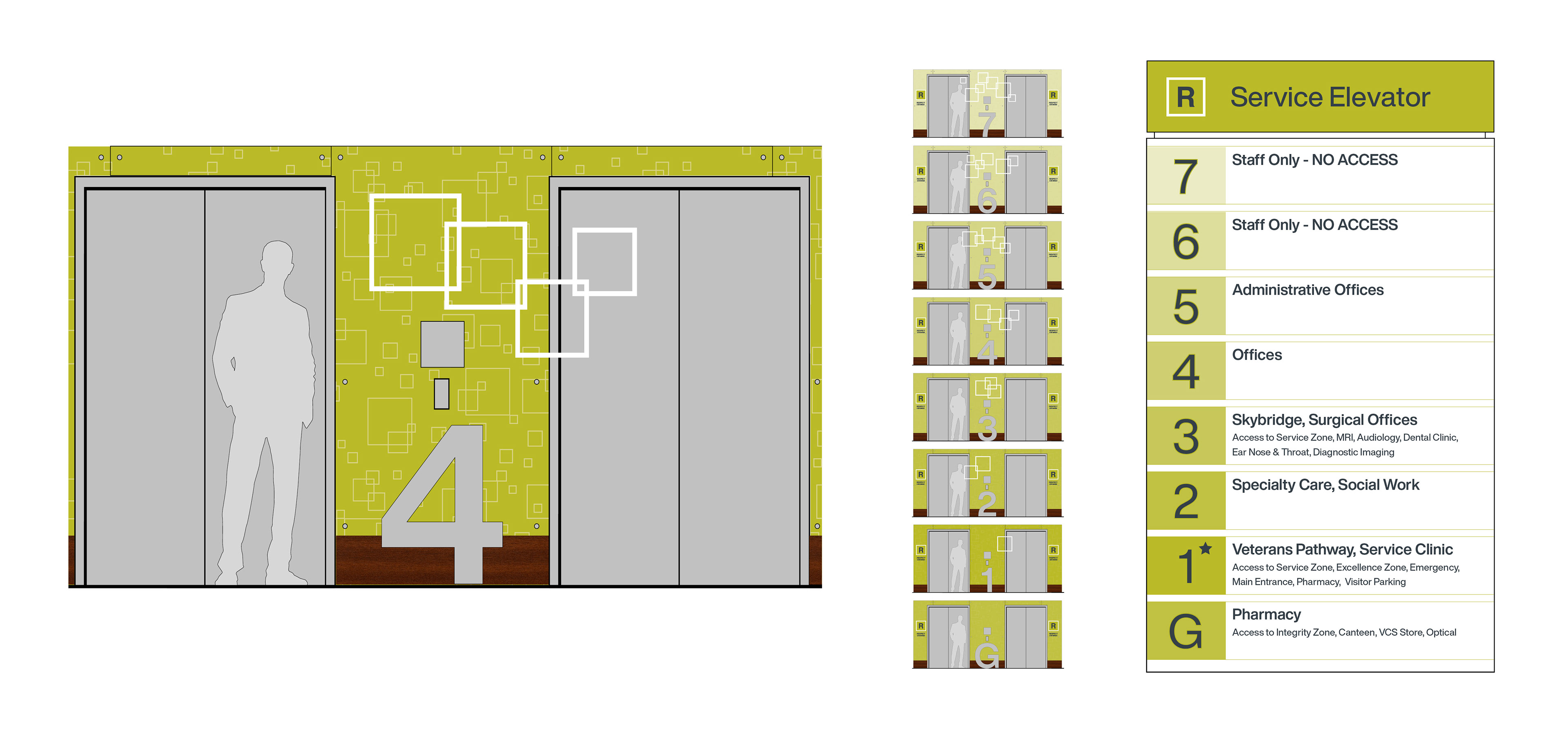
Multiple cues extend to the elevator columns within each zone. Floors are marked by level number, icon, and color gradient. When traveling up the elevator column, the tint of the corresponding zone color lightens with each floor.
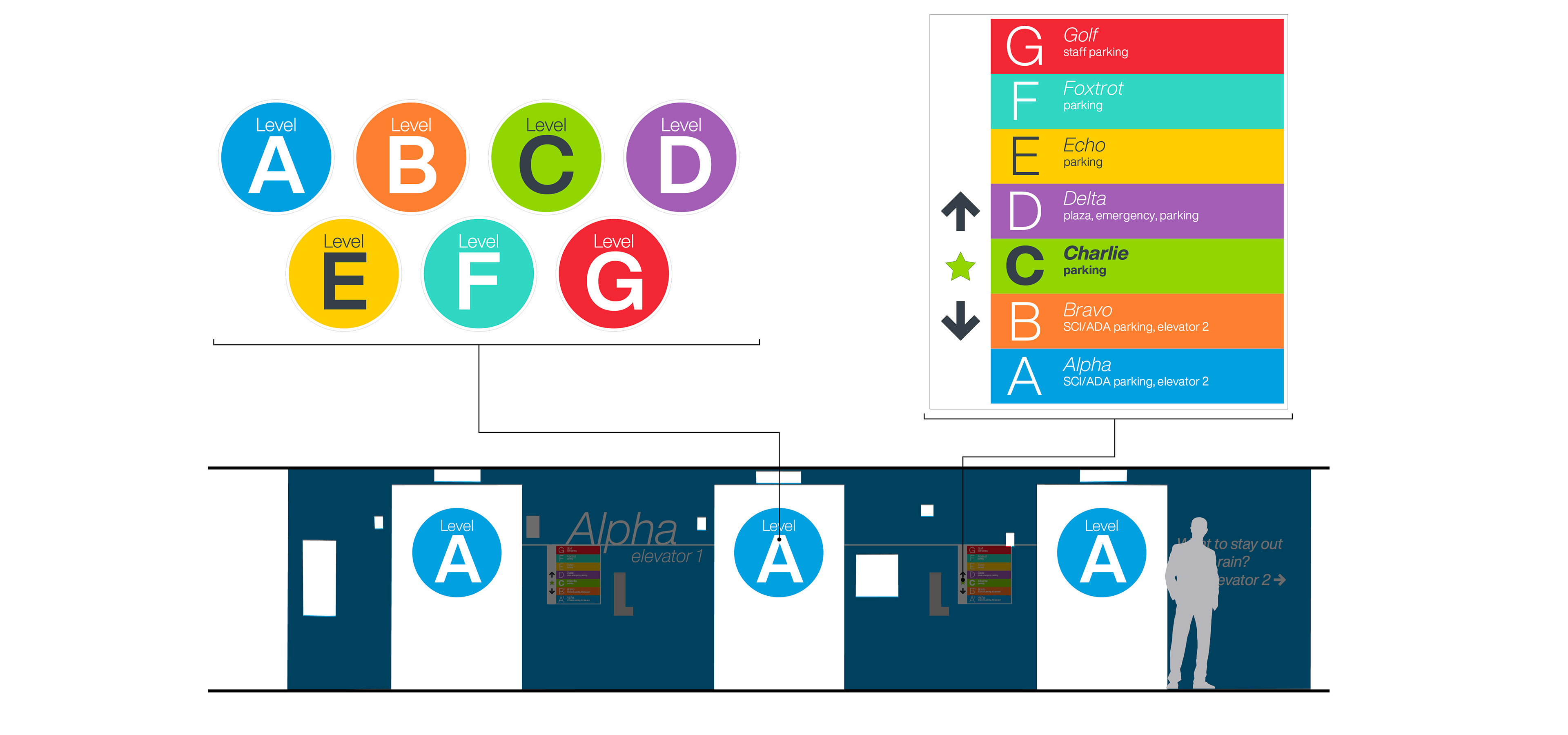
Initially, elevator walls of the parking garage and hospital interior were colored and numbered nearly identically to one another, leading many visitors to confuse the floor numbers of their appointment and their parking space.
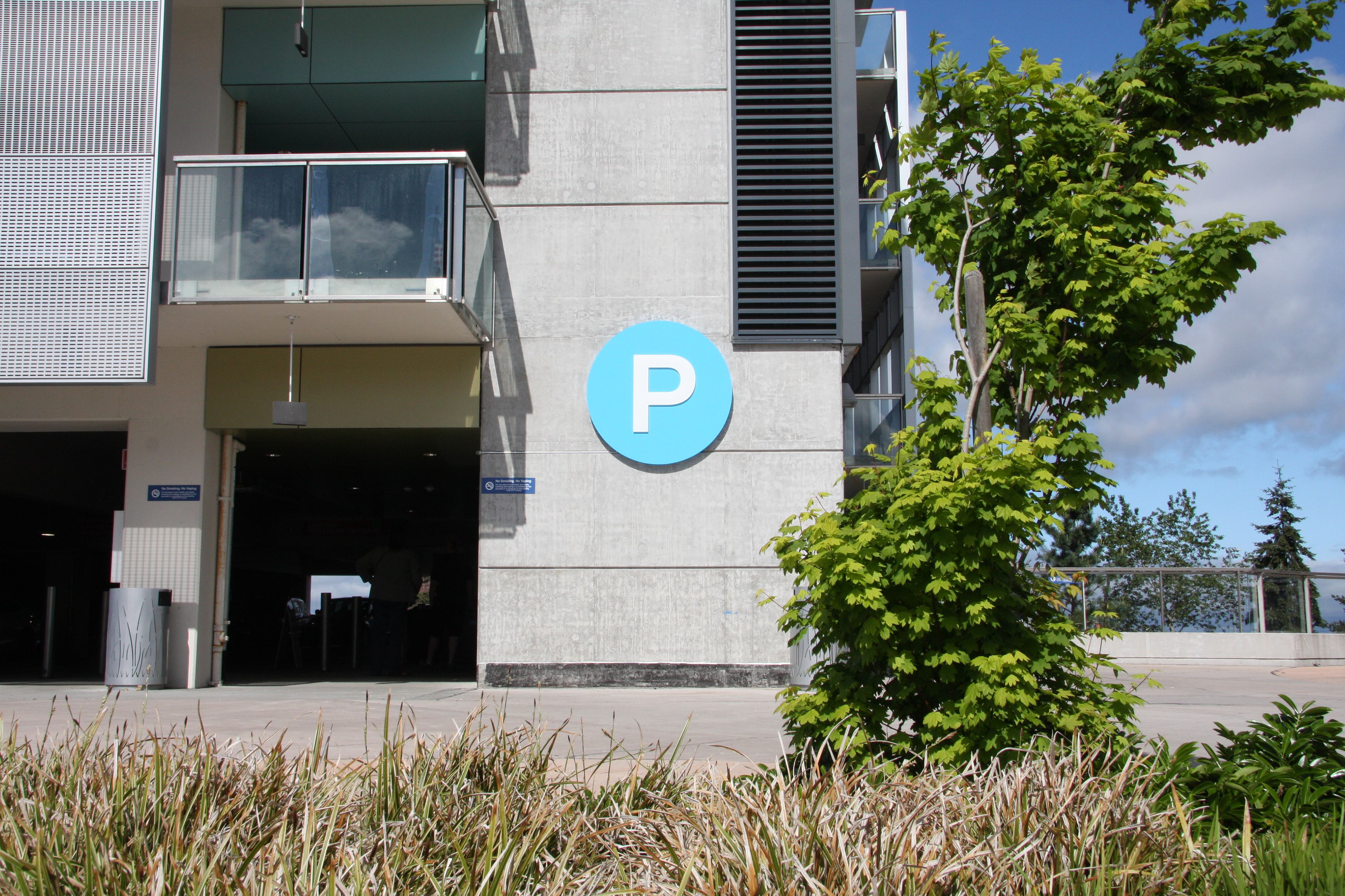
Further inspired by veteran culture, we solved this issue by referencing the NATO phonetic alphabet and changing the parking garage levels from numbers to letters. The colors in the garage are bright and saturated to compensate for the low light levels and differentiate them from the zone colors within the hospital.
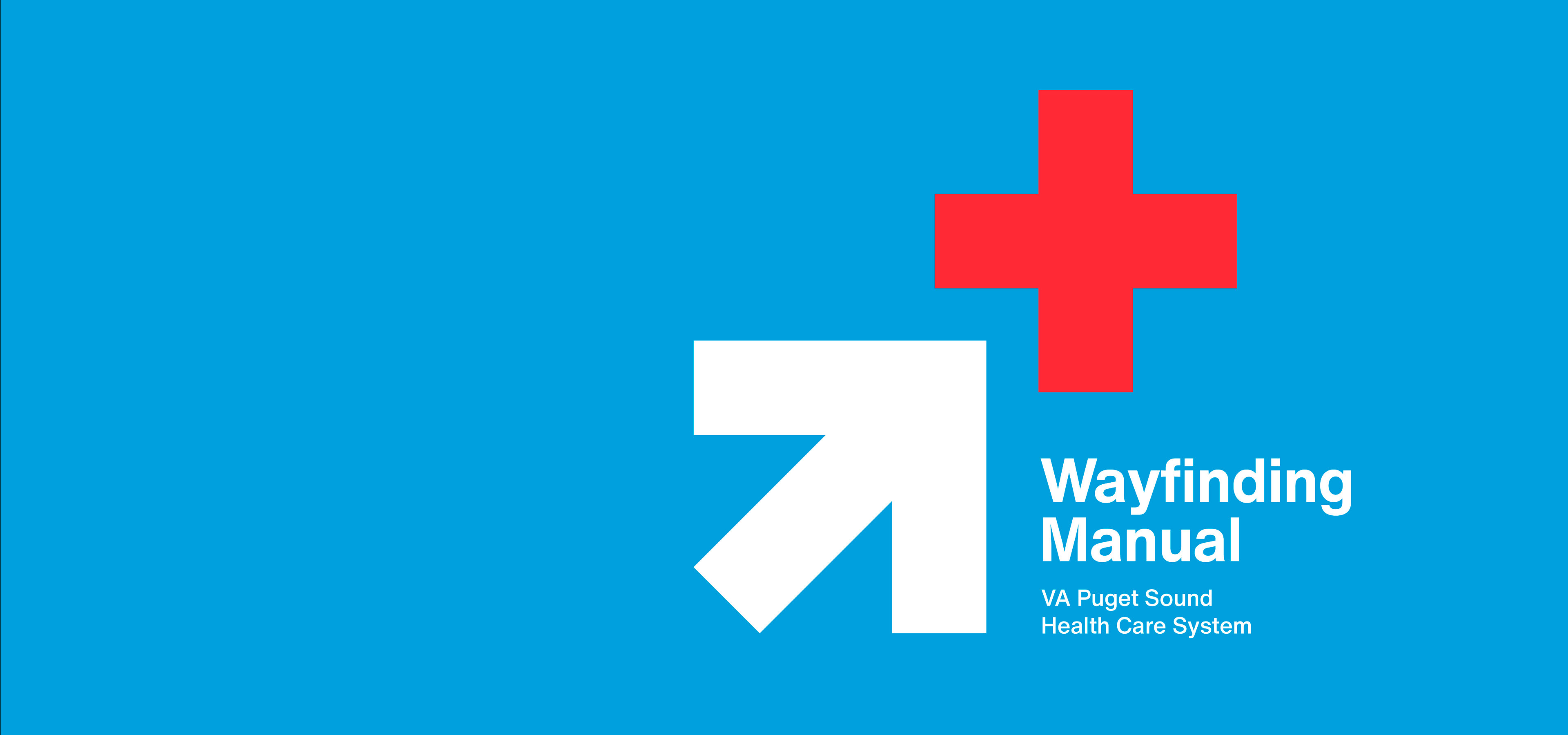
THE RESULTS
Our team produced a wayfinding manual to act as a companion to the National VA Design Guidelines. This manual gives the VA a useful toolkit to implement and maintain the wayfinding system. It also serves as a foundation to replicate the success of the Seattle VA Hospital wayfinding program at other VA locations nationwide.


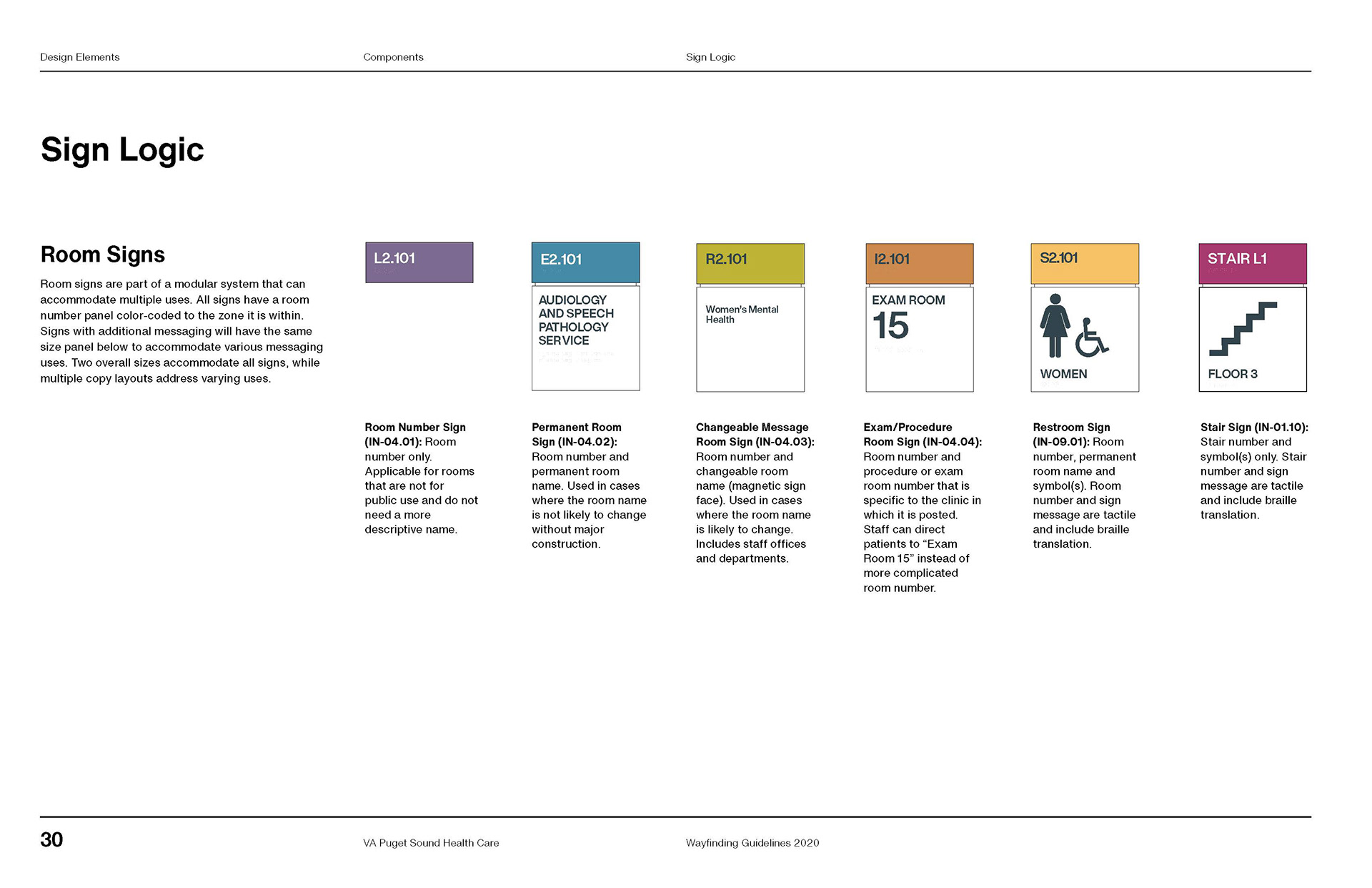
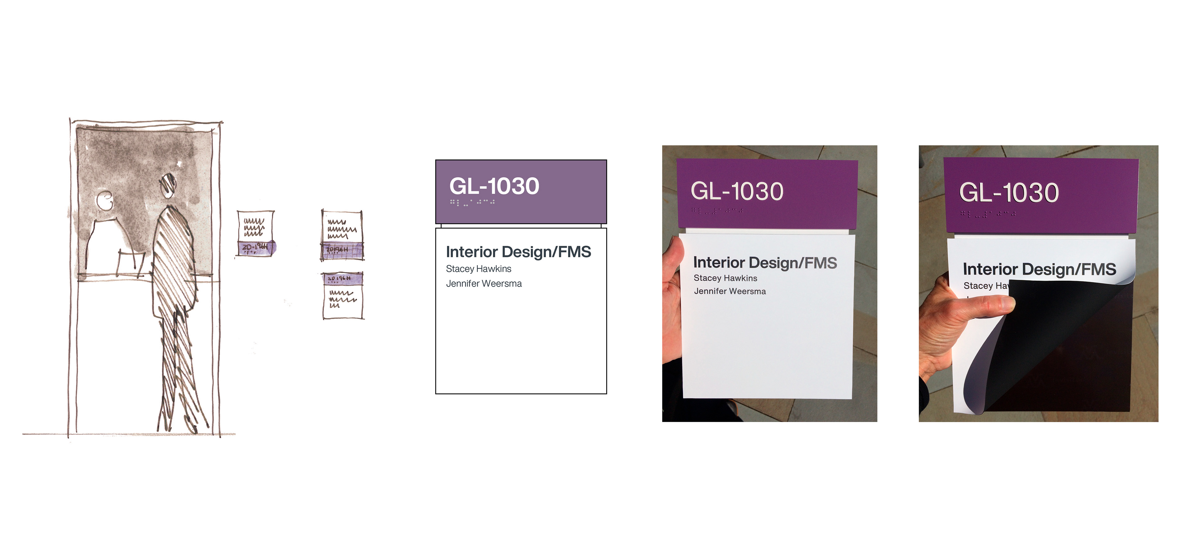
Patient information and office residents are changing constantly. Individual room signs allow for this flexibility by using a sheet of magnetic material that allows information to be interchangeable throughout zones.
As of this writing, further prototypes are being installed.