The Context
From the rings to the venue, from the decorations to the graphic identity, our wedding was almost entirely DIY.
THE CHALLENGE
Design the full wedding identity and collateral for the pickiest client of all: myself. Luckily, I had a smart, savvy, and realistic project manager to help keep me in check. She stuck around after the project, and we've moved on to a longer-term project: designing a life together.
SKILLS BILLED
Creative Direction
Visual Identity
Print Design
Vow Writing
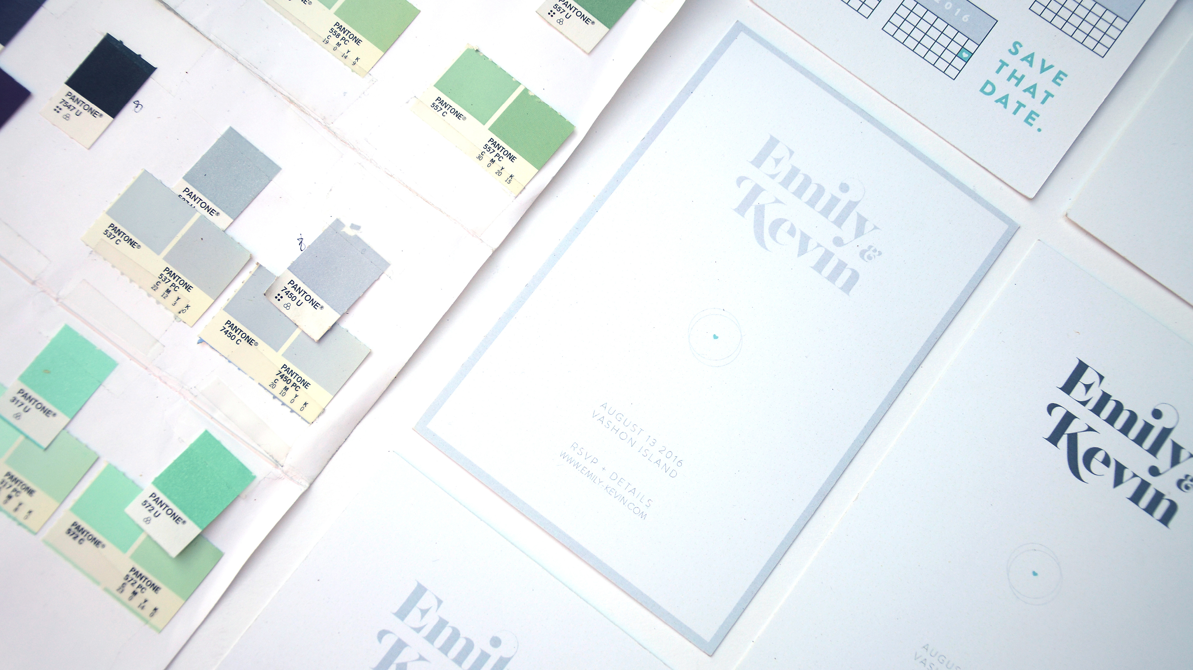
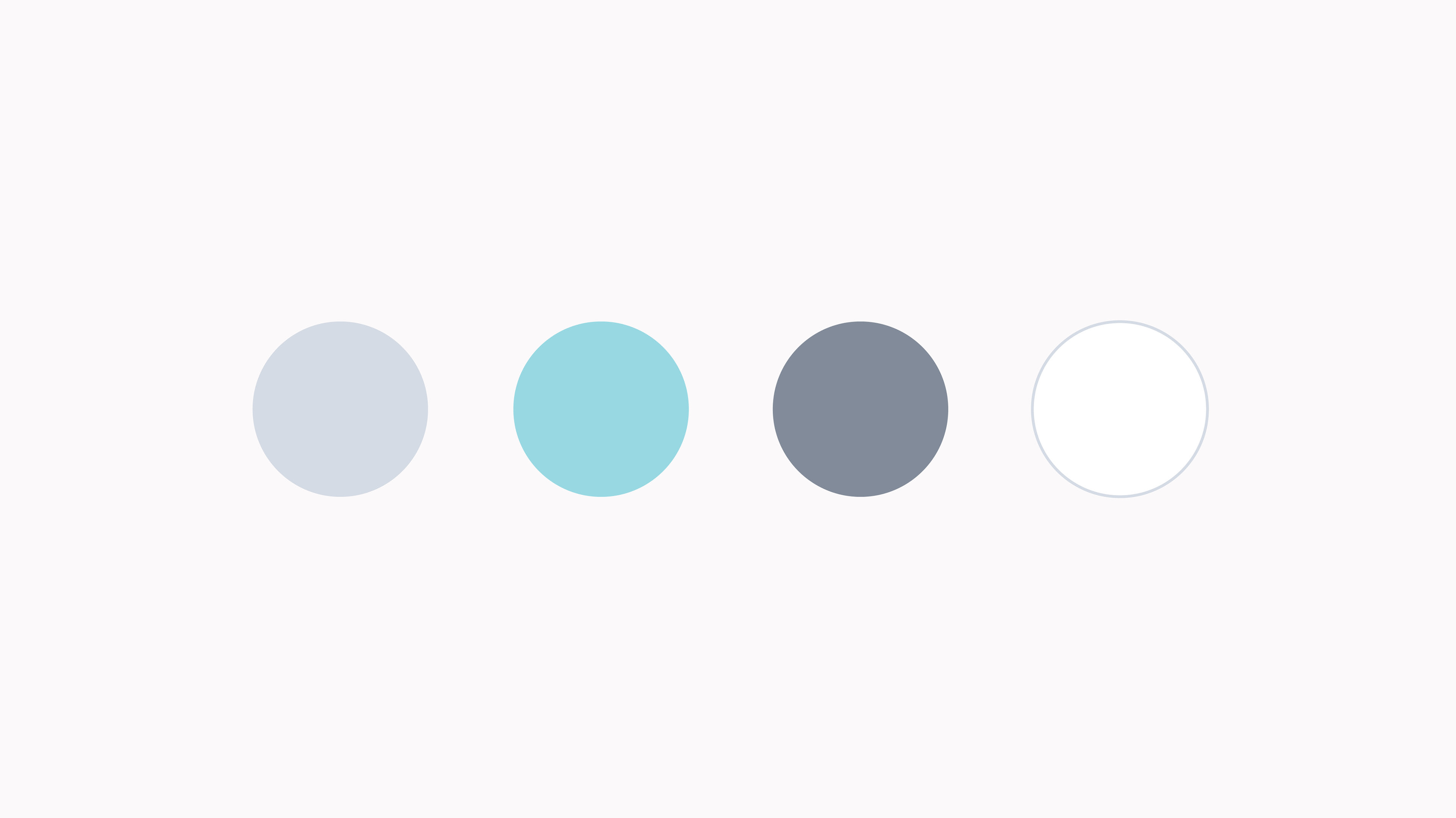
A goal of the color studies was to make a selection that felt elegant while also being celebratory and unique to our story. The palette borrowed colors from the shades we painted our first apartment, one of many easter eggs that lay hidden in the design.
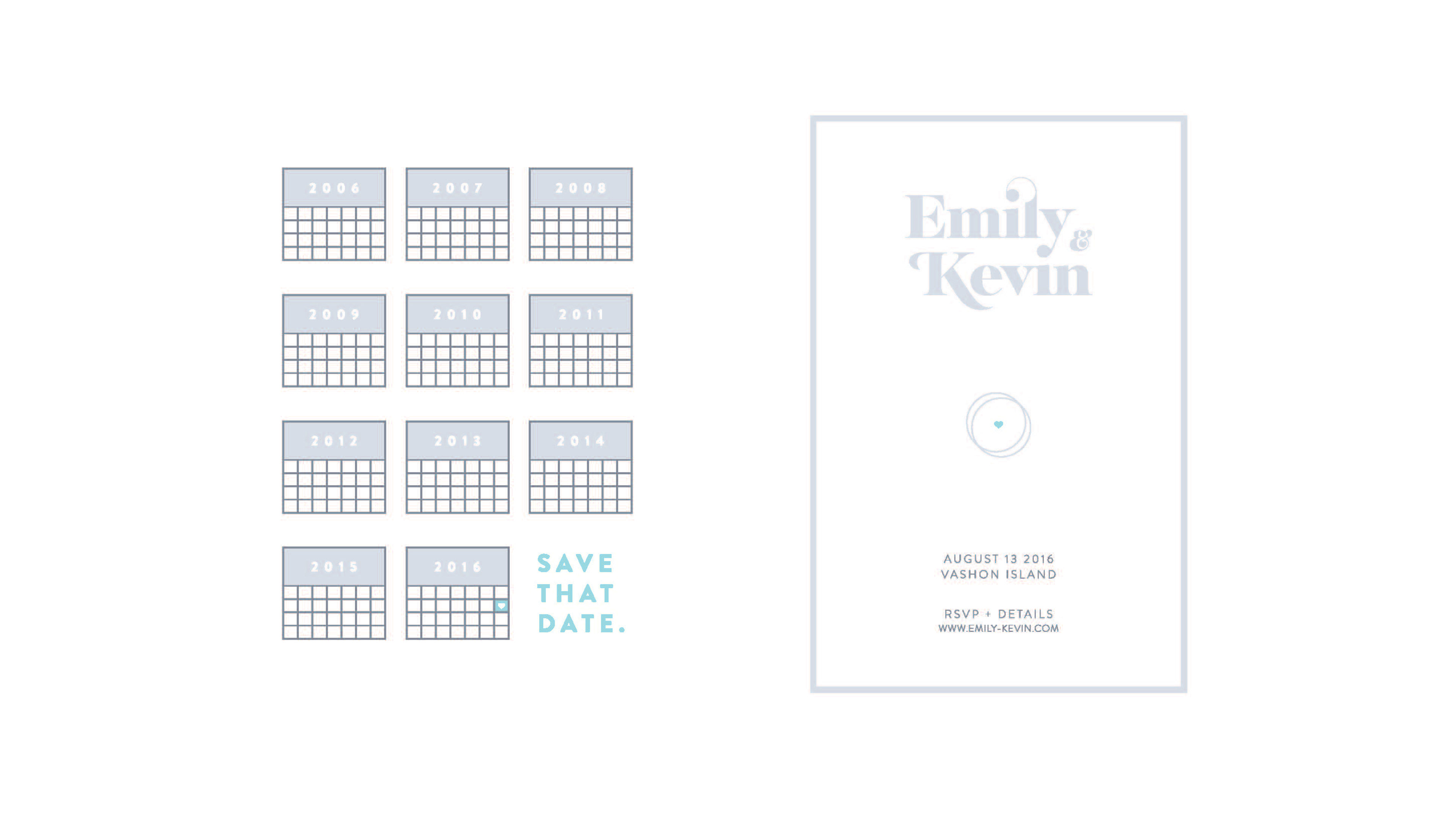
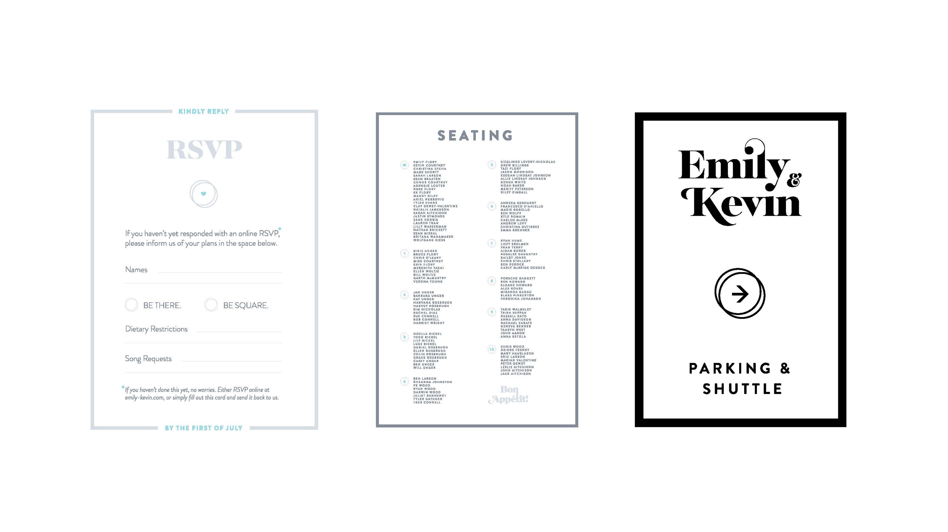

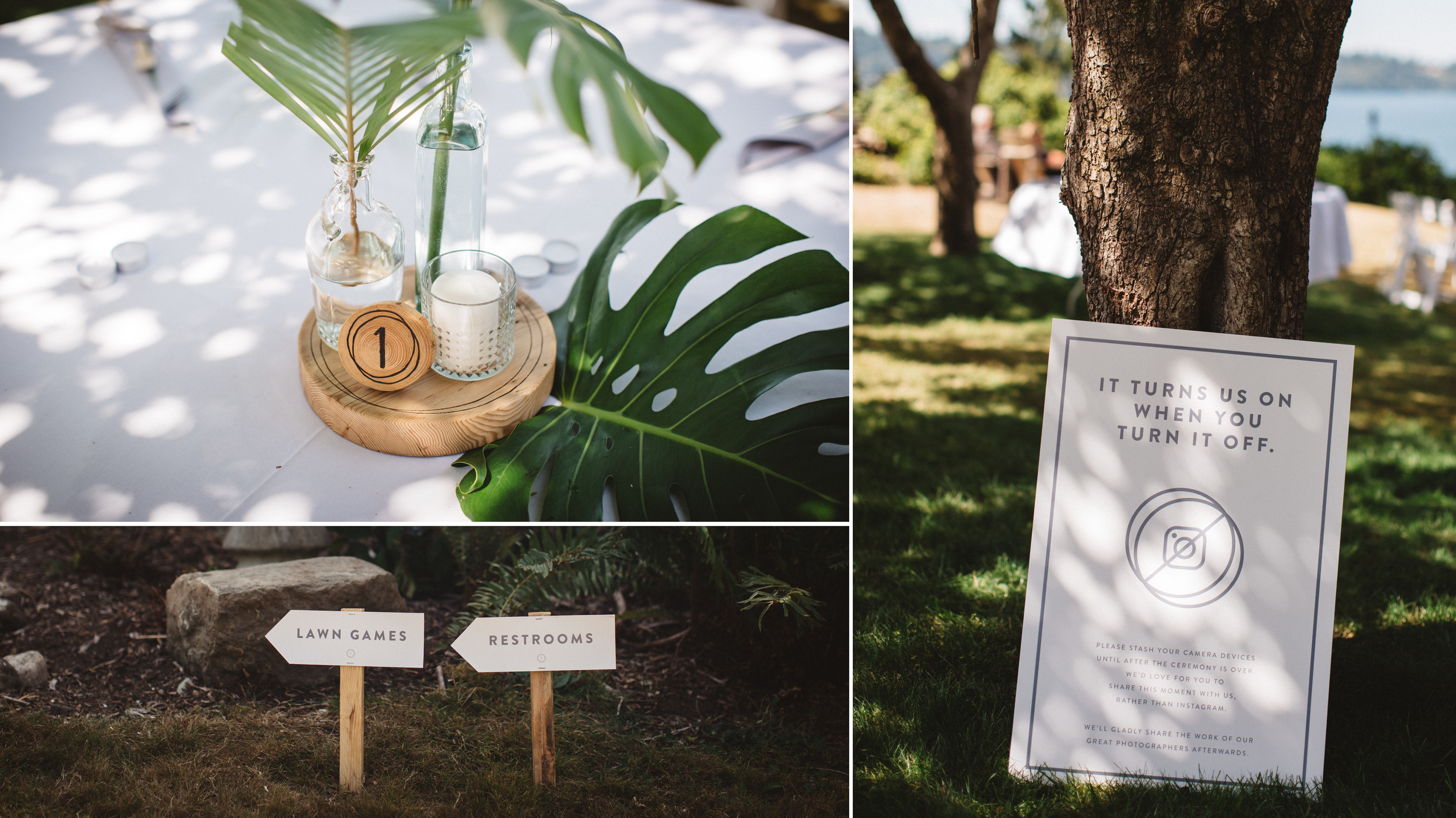
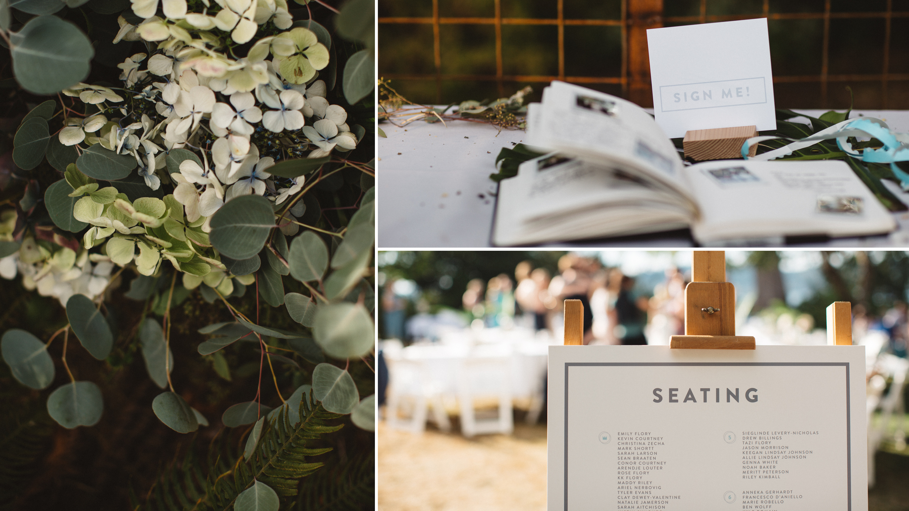
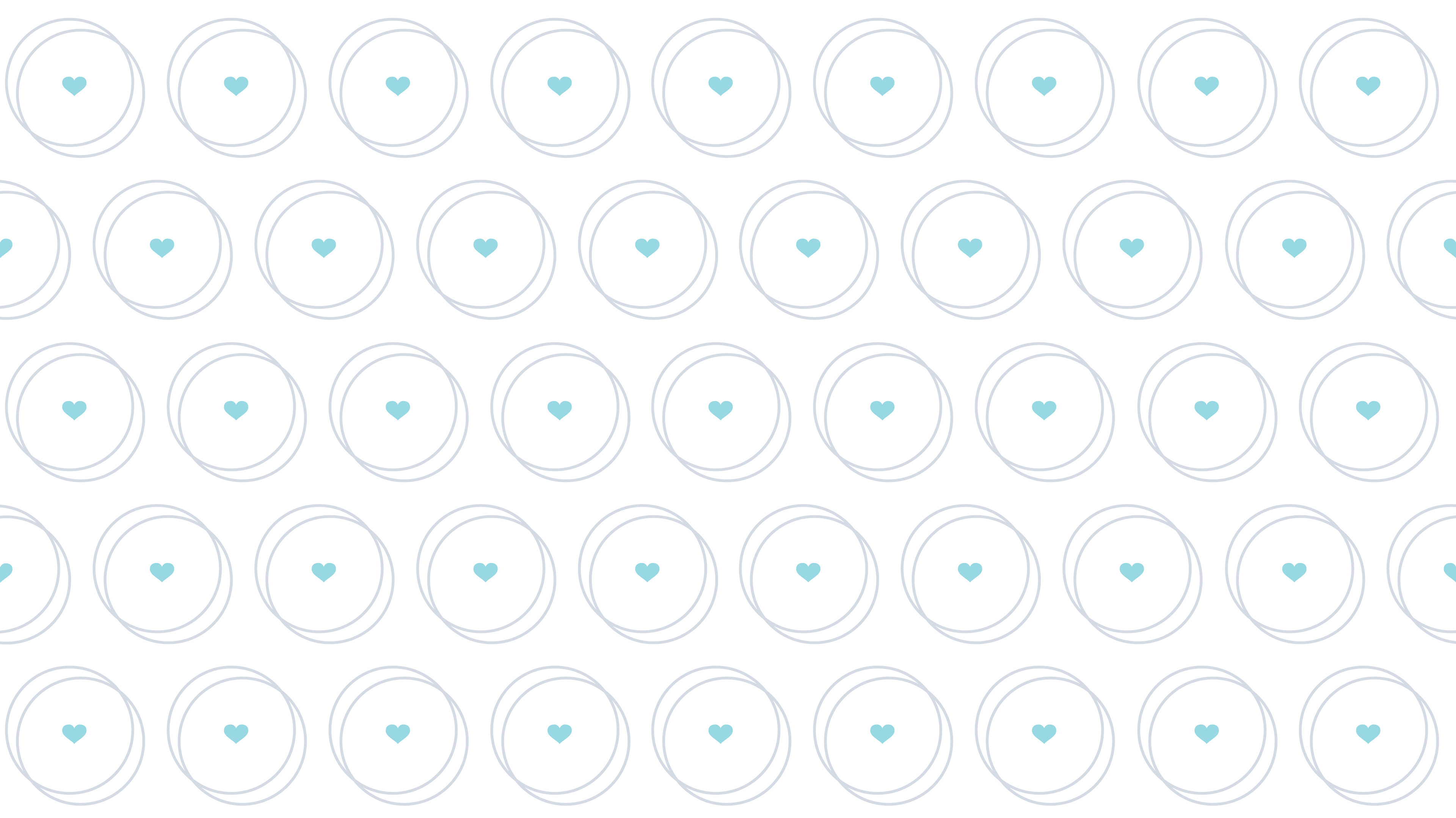
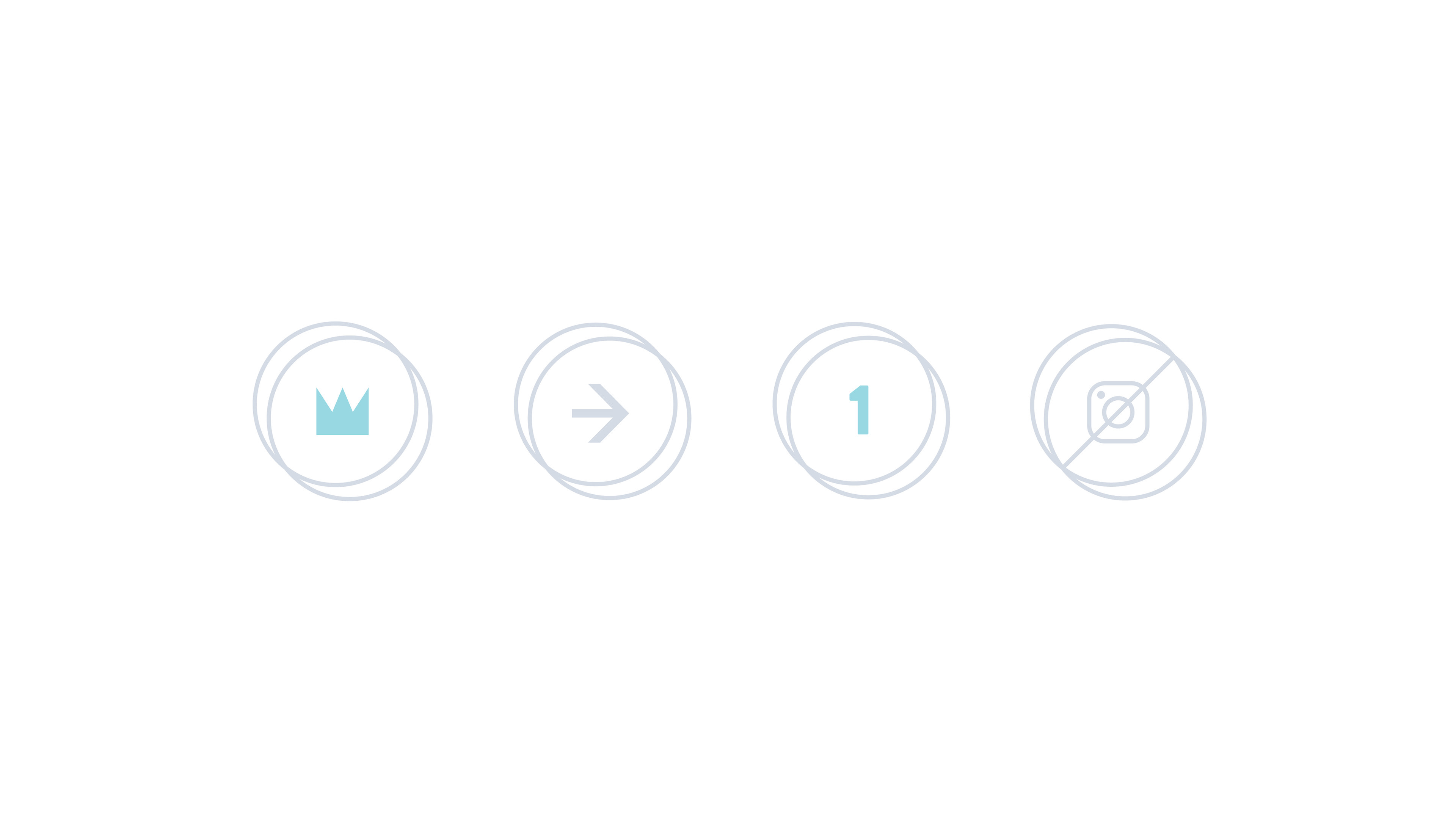
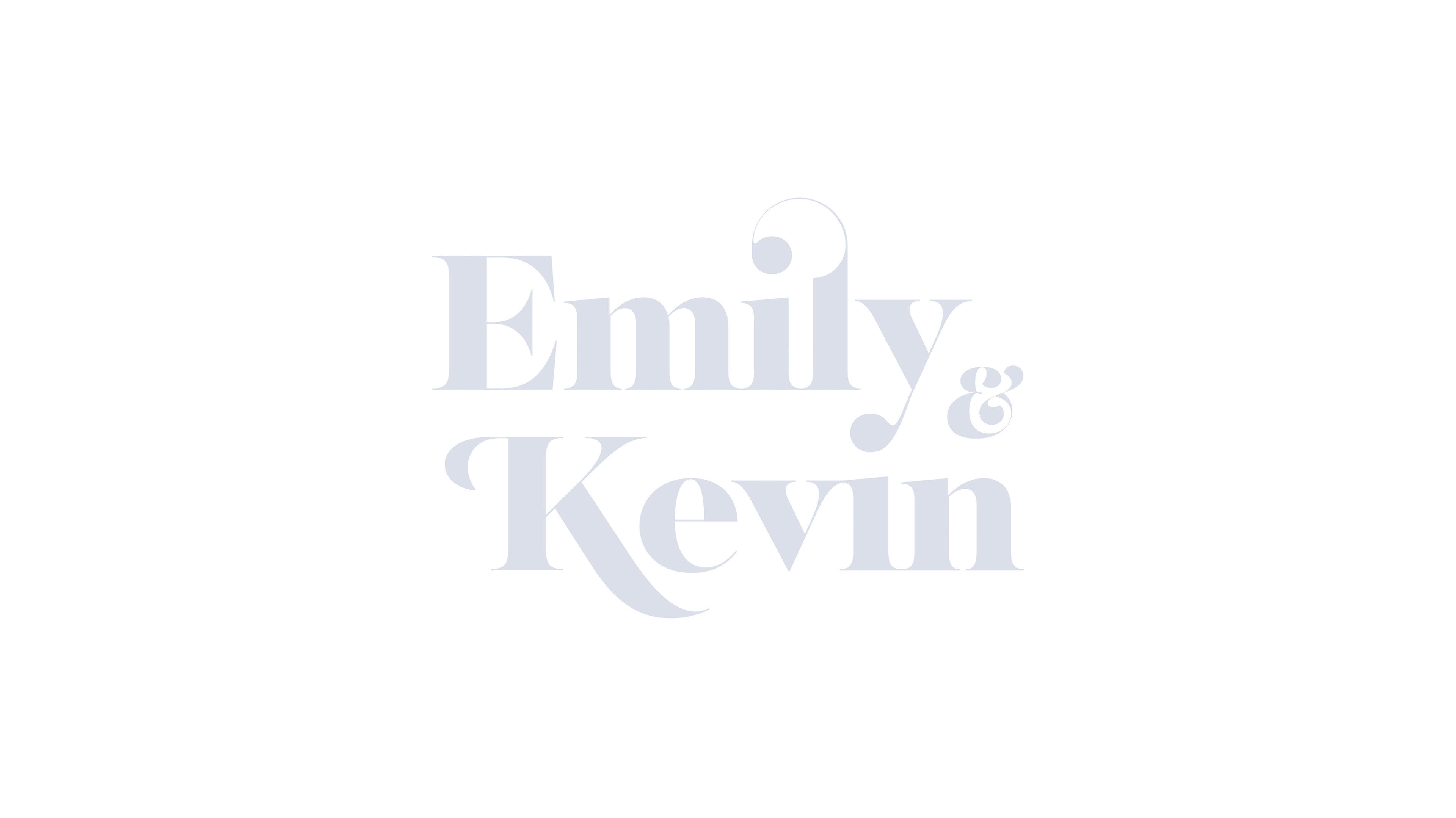
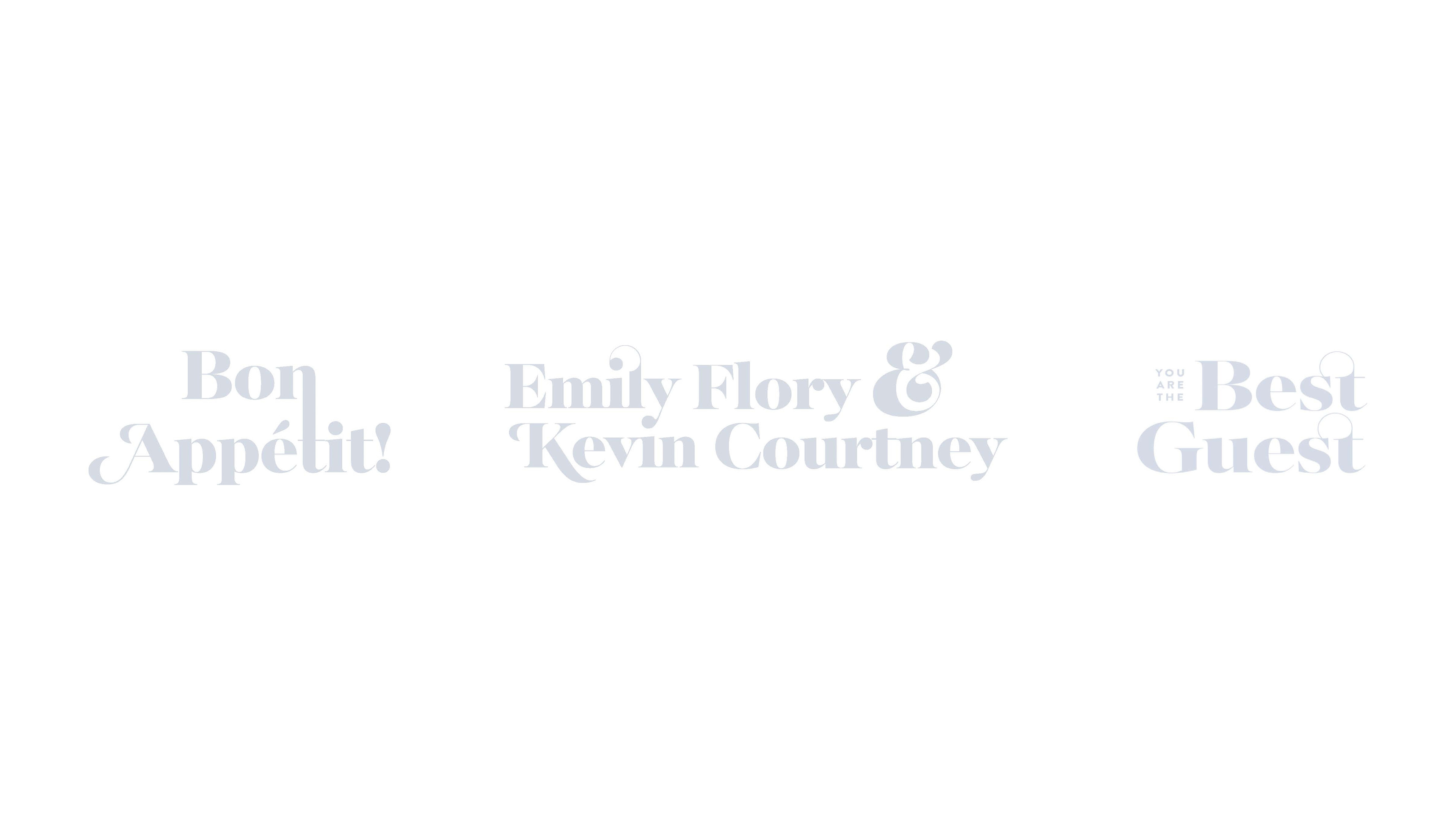
Representative of the union that exists between two rings, the circle icon was reused many times over, from directions to meal preferences to place settings.
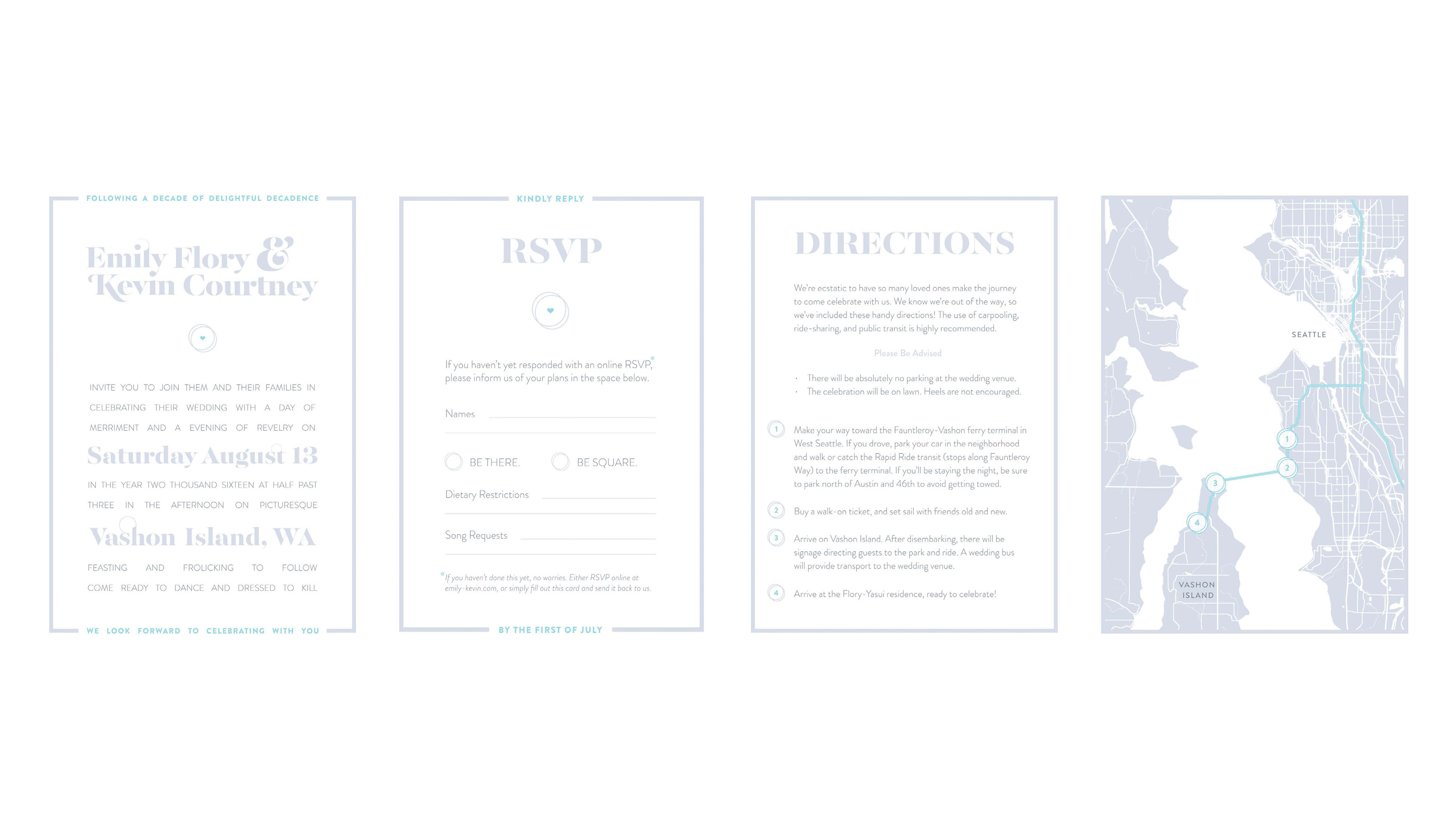
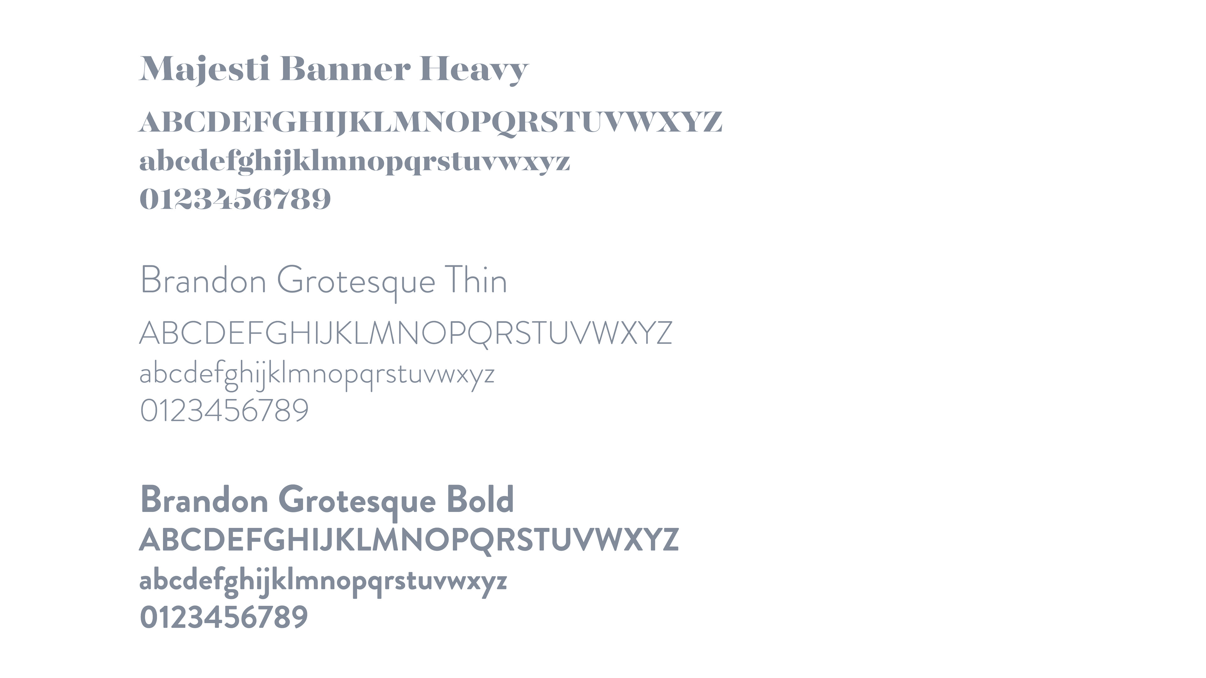
The contrast between the elegant playfulness of serif and the subtle rounding of sans serif facilitated inviting and entertaining typography that felt true to the character of the event we wanted to curate. Experimentation with ligatures and other typographic elements further played to the theme of union and harmony.
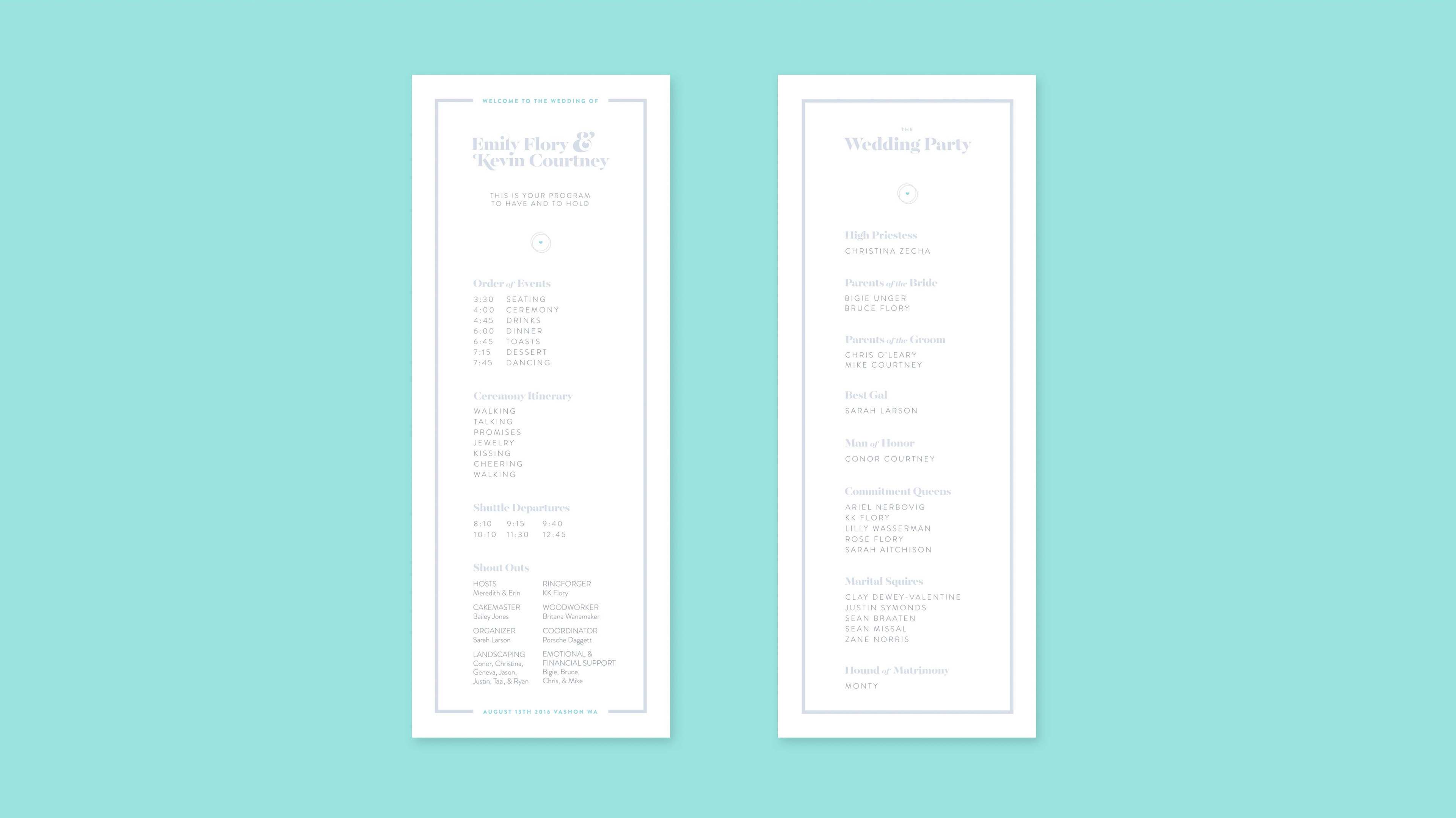
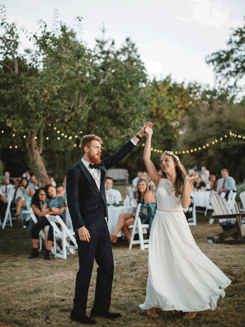
It was important to us that our guests feel like they were attending a celebration of our relationship, rather than a generic event. In addition to lawn games and a food truck, we hammered home the idea of fun by choosing non-traditional verbiage filled with in-jokes and tried not to take ourselves too seriously. The result? Lots of laughter, glowing compliments, and the best day of our lives (so far).