The Context
JCR Development is a family-owned real estate development company founded in 1975. The founder had recently passed away and the current leadership (his son, daughter, and management team, with input from his widow) wanted a fresh, contemporary image for the company. The new identity would be primarily used on the client’s letterhead package and migrate to their digital communications. The program included new signage for their new office space.
The Challenge
Shepard the company identity into the current era, while referencing and respecting the rich legacy of its past.
SKILLS BILLED
Visual Identity Refresh
Campaign Photography
Art Direction
Print & Fabrication Supervision
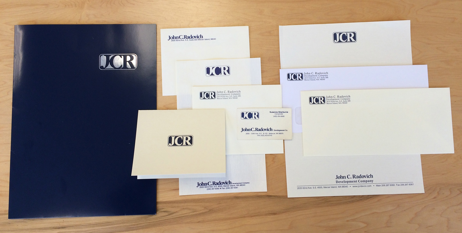
Original brand collateral from the mid-1970s.
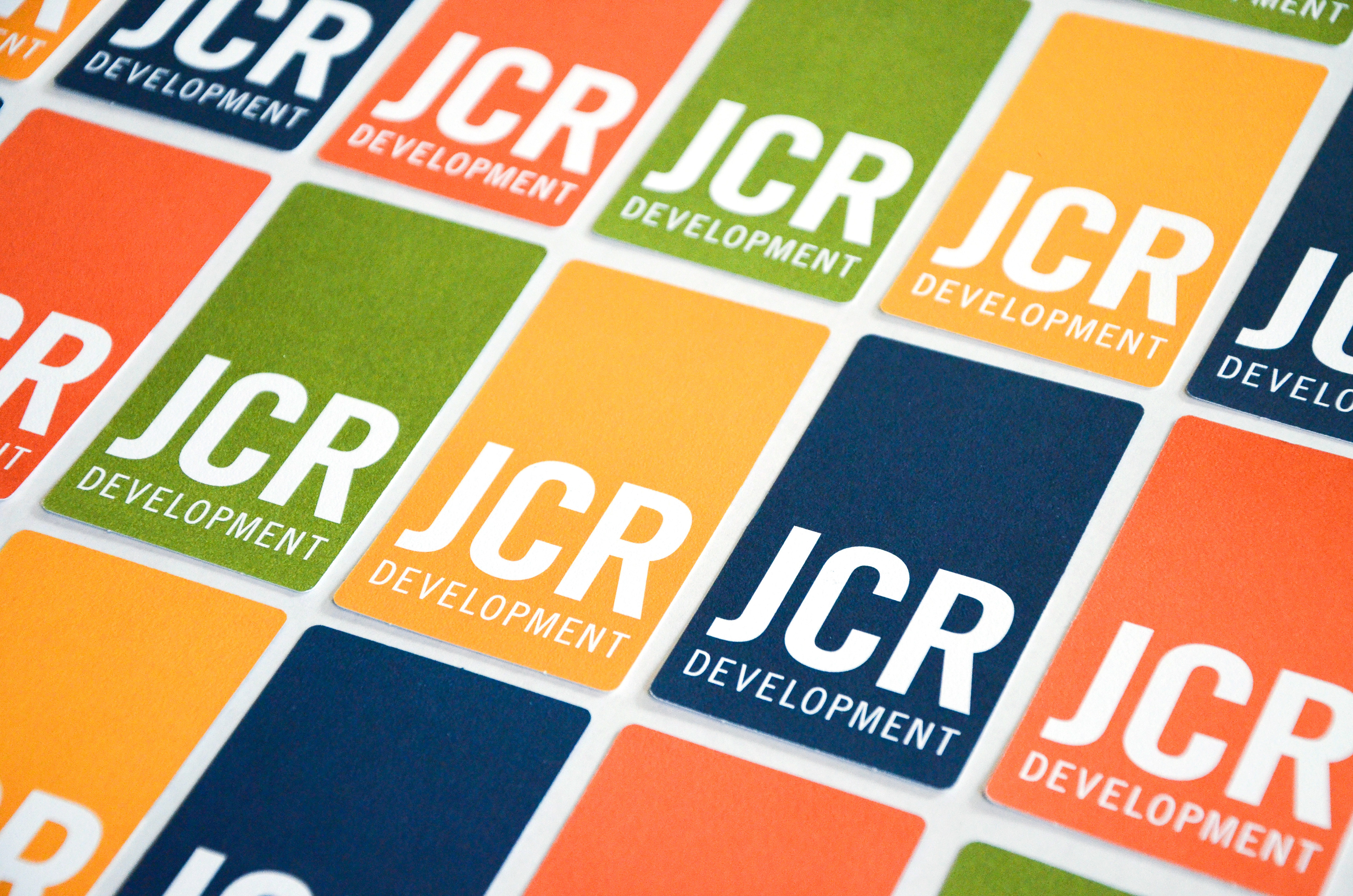
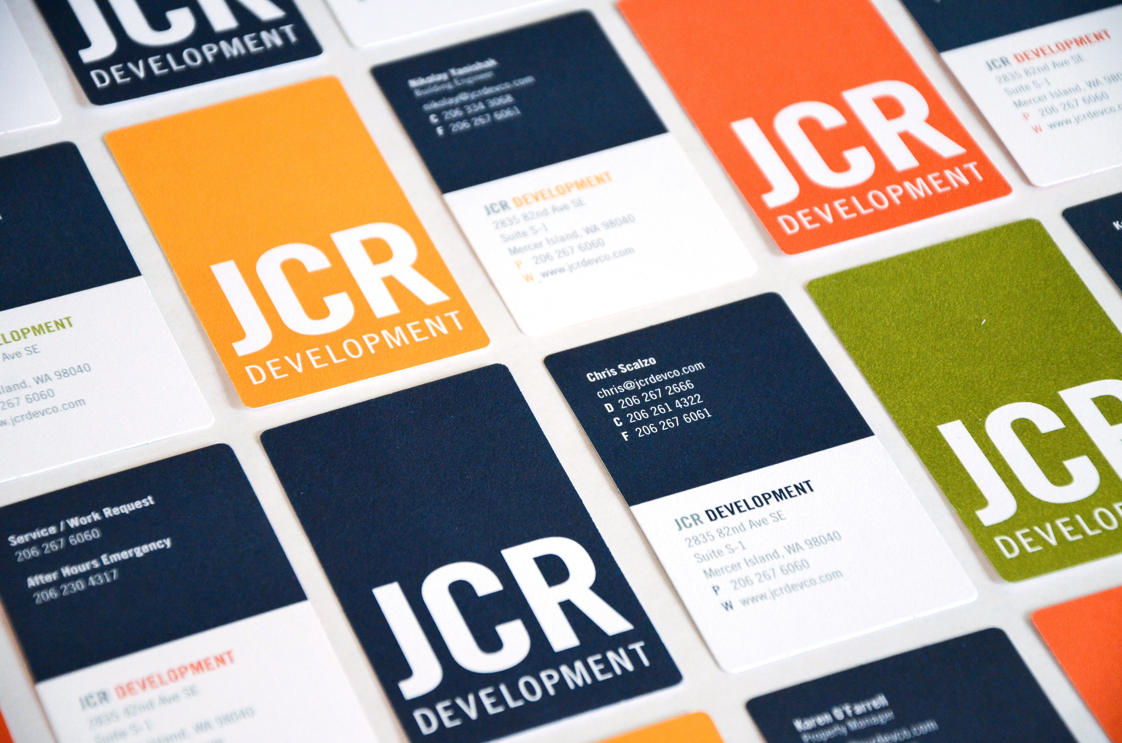
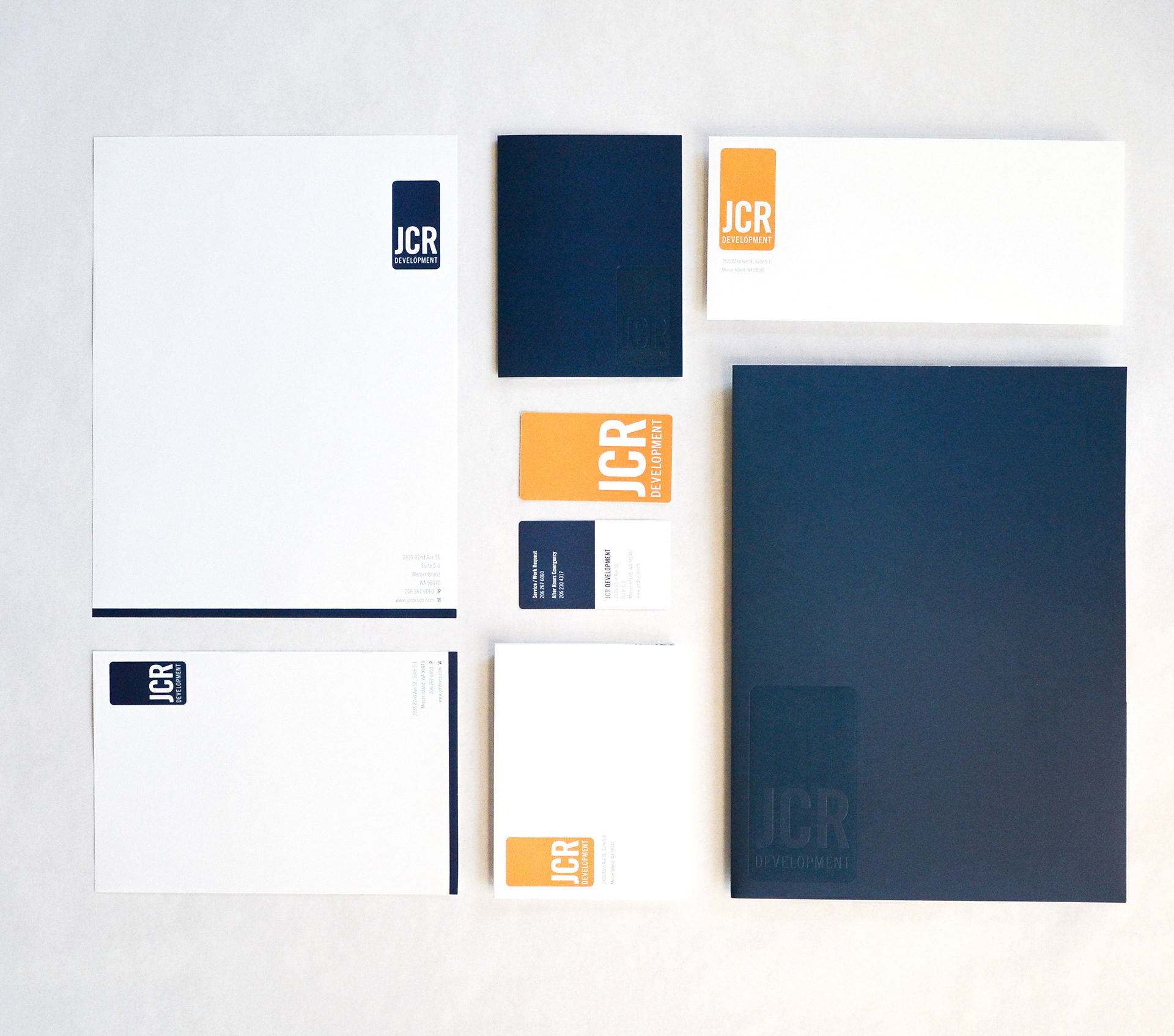
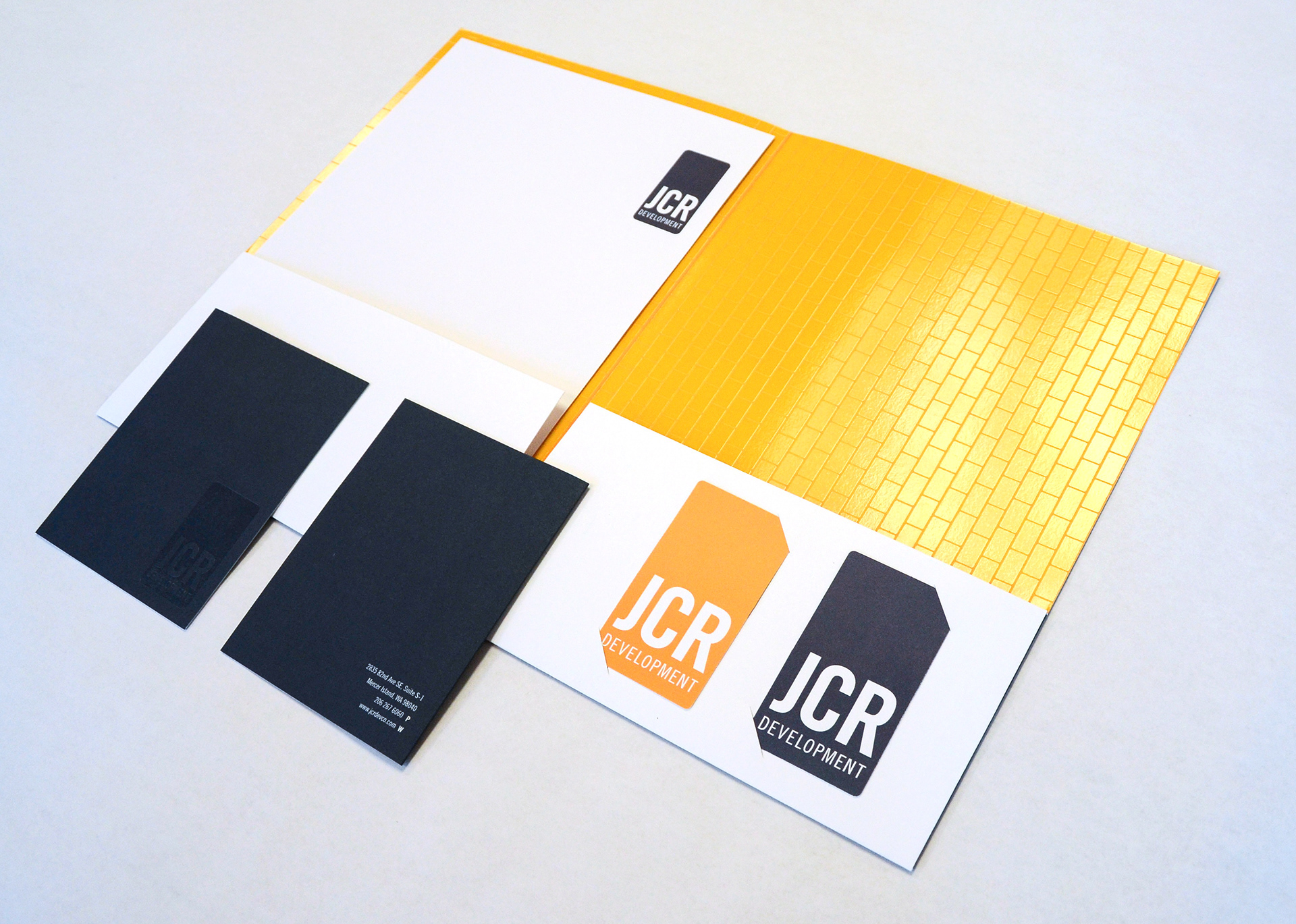
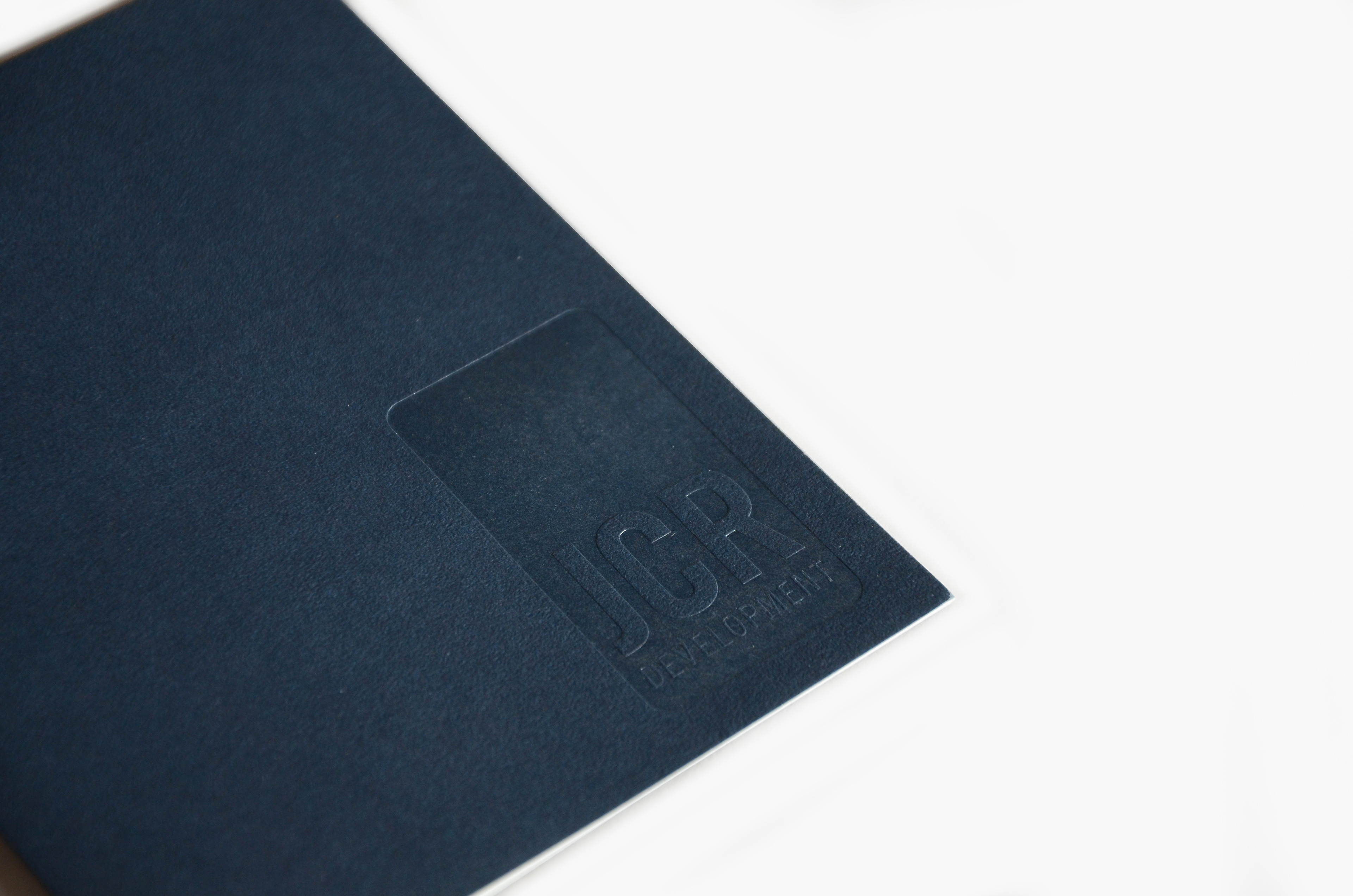
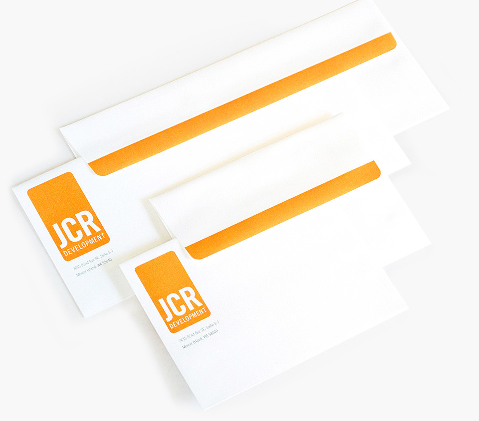
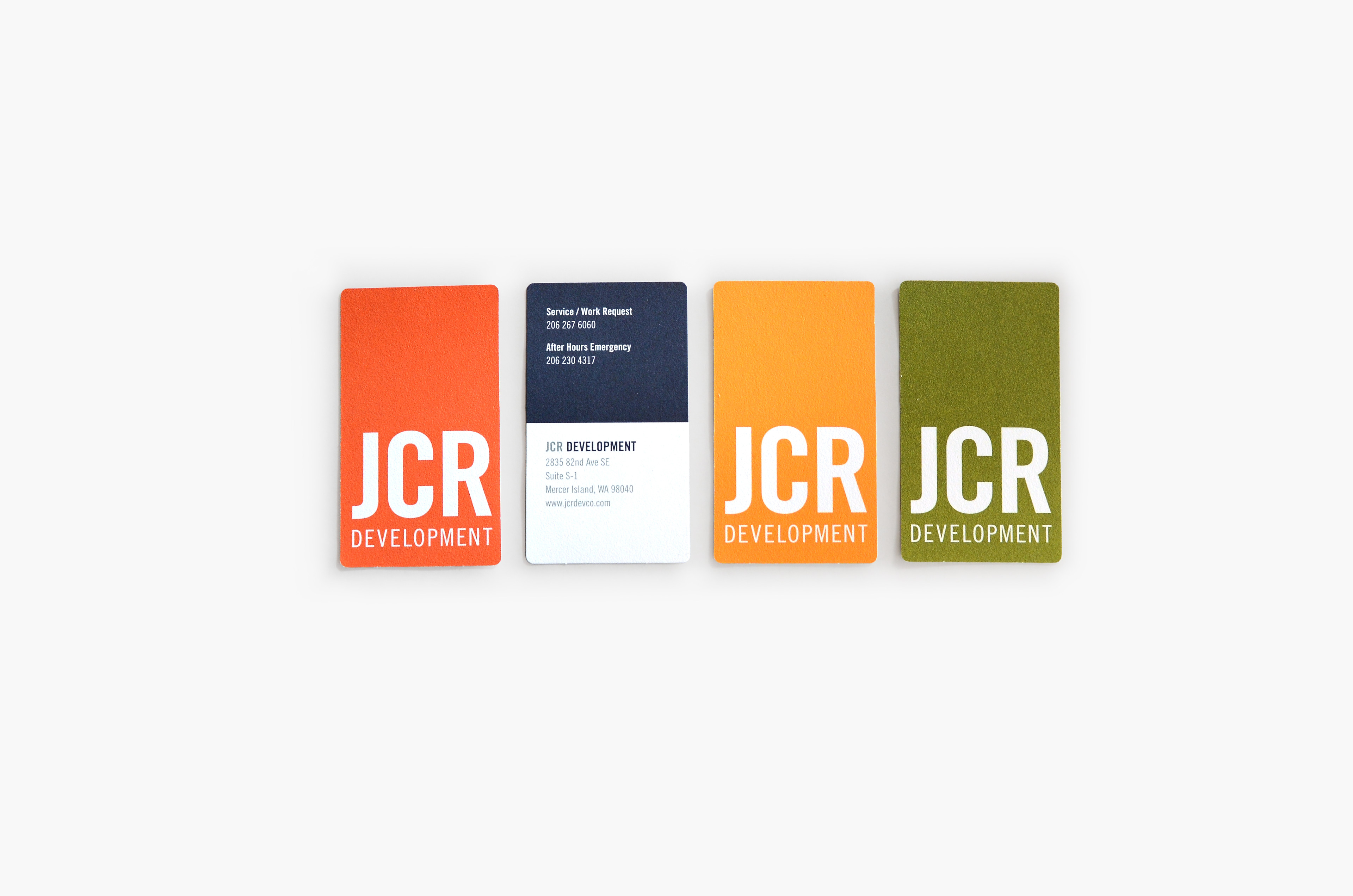
The concept that resonated with our clients used a simple, clean layout and business cards with multiple colors on the back. Colors were chosen to work with deep blue, a legacy color from the original identity.
The updated logo references the original logo with a reinterpreted and reoriented architectural badge shape.

THE RESULTS
Our immediate clients were pleased, as was their Mom. This update represented a step forward into a new future for the company without abandoning its treasured past.
This project won a Graphis Gold award in the Creative Services category.